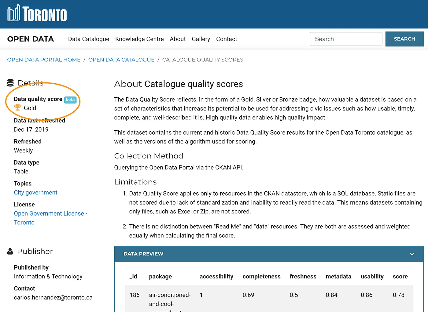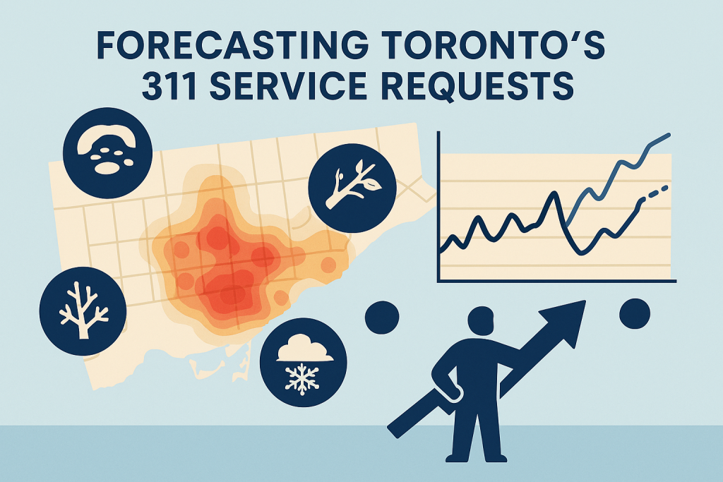
Problem Statement: Toronto’s 311 system receives thousands of service requests every year from potholes and downed tree limbs to park maintenance, graffiti removal, noise complaints, and snow-removal requests. However, the open 311 dataset represents only 30–35% of total requests and covers just 6 of the City’s 45 divisions. While these requests are often treated as operational tasks, many also serve as early indicators of infrastructure stress and community needs across Toronto’s 25 wards.
Despite its value, the open 311 dataset is difficult to use for long-term analysis. Service request categories have been renamed, merged, or discontinued over time; ward boundaries have undergone major restructuring; and critical fields such as request closure dates are missing. These limitations make it challenging to identify trends, forecast workloads, or support proactive service planning.
This project set out to address these challenges and explore whether 311 data—when properly cleaned and enriched—could be used to predict future service demand and support proactive, city-wide maintenance planning.
Project Evolution: The project initially began as an effort to analyze pothole-related service requests and map them against traffic collision hotspots to study road health and safety. However, as the complexity of the dataset became apparent—particularly the large number of service categories and ward inconsistencies—the scope expanded into a cleaning the dataset and creating a predictive model to support proactive maintenance operations and planning.

Step 1: Data Cleaning and Harmonization
The dataset available has a missing sub-section column (for Environmental Requests) which was added manually on Excel. The Environment division had undergone multiple name changes from Parks to Urban Forestry to Environment. These changes and the next were carried out in Python.
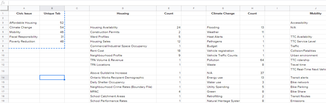
A major early challenge was standardizing the service request data. The dataset contains over 850 unique request types, many of which describe the same issue under different names or were retired and replaced over time. I manually reviewed more than 200 request types across the Environment and Transportation divisions, identifying functional equivalents and consolidating them into standardized categories.
In parallel, ward information was harmonized to account for Toronto’s transition from a 47-ward model to the current 25 wards. Outdated ward names were remapped using geospatial analysis, creating a consistent spatial framework for historical analysis and forecasting.
Step 2: Feature Engineering and Data Enrichment
To help machine learning models learn reporting behavior and seasonality, I engineered a series of temporal and environmental features on PostgreSQL to create reusable tables for analysis, including:
- lag variables and rolling averages for service requests and weather data
- freeze–thaw indicators
- days since last snowfall, consecutive snowfall
These were combined with open climate data, green-space characteristics, and spatial density metrics to capture why requests spike in specific locations and seasons.
Step 3: Modeling and Forecasting
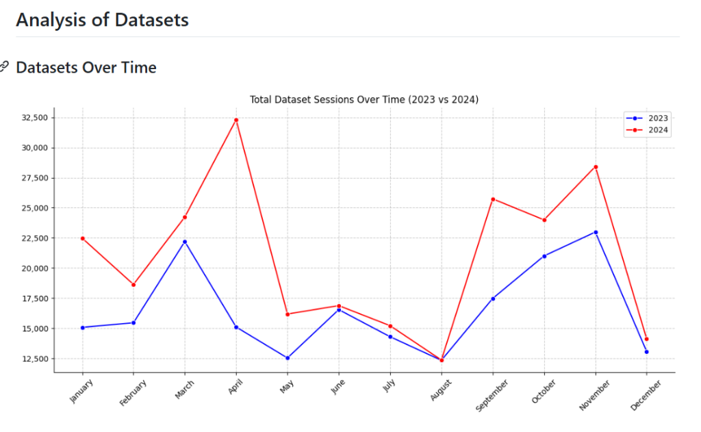
The cleaned and enriched dataset was used to build models that predict next month’s service request volumes at the ward level. Results were particularly strong for Forestry Operations, which account for 85% of all environment-related requests, with the model explaining over 90% of the variance. These forecasts support better staffing, reduced overtime, fewer service backlogs during peak periods, and more targeted deployment in high-need neighborhoods.


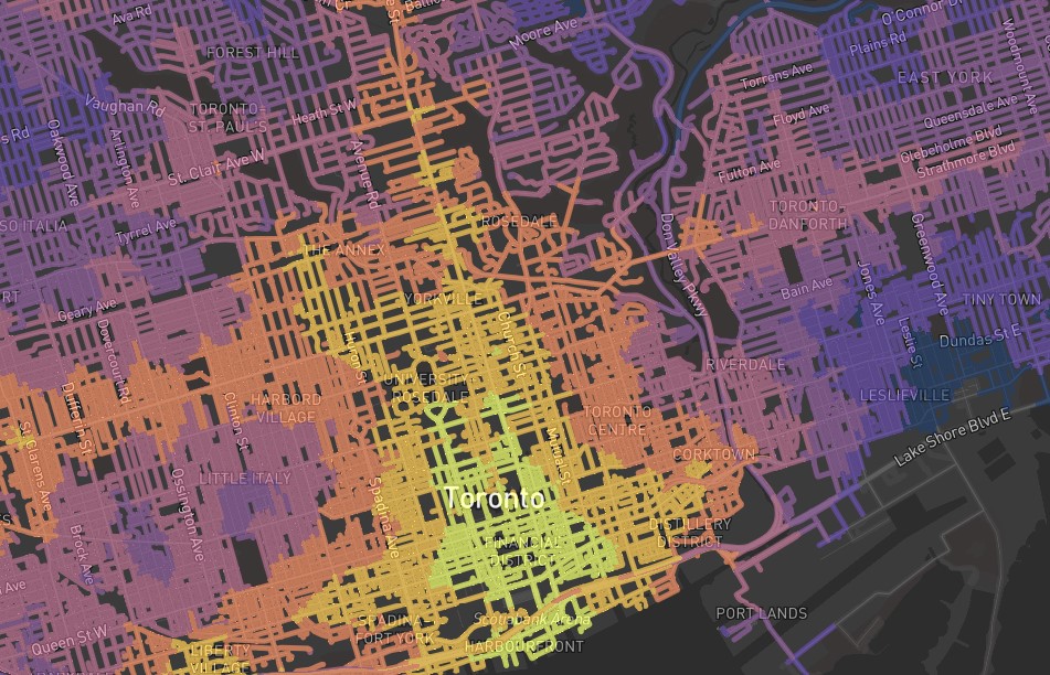
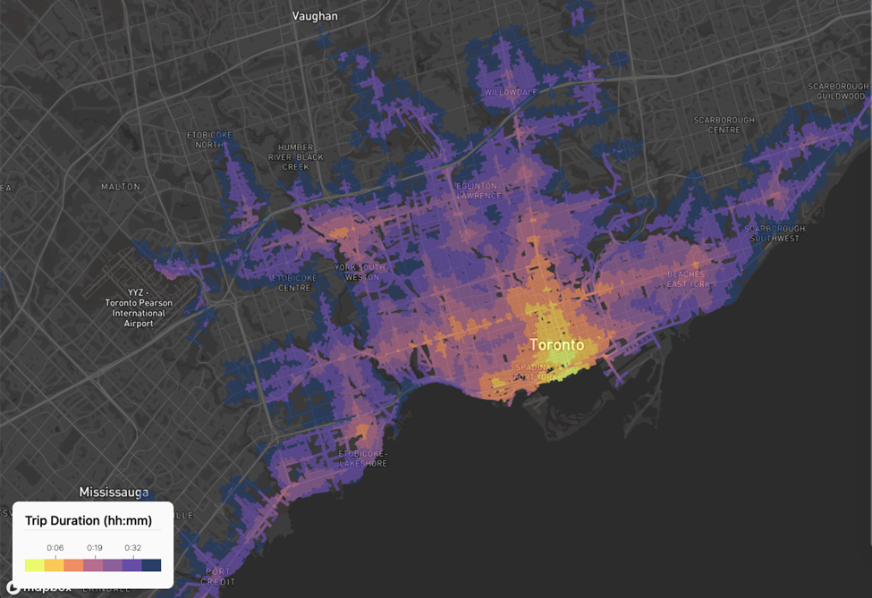
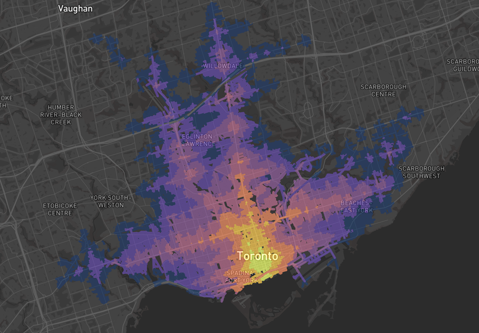
Step 4: Visualization and Decision Support
To make the insights accessible, I built interactive Power BI dashboards showcasing:
- To make the insights accessible, I built interactive Power BI dashboards showcasing:
- seasonal patterns and year-over-year trends
- ward-level differences in service demand
- climate correlations
- predicted service volumes
A ward-level distribution mechanism allocates forecasted totals into individual service types using historical monthly patterns, enabling realistic and actionable workload planning.


Outlier Study and Model Diagnostics
Understanding when and why the model fails was a critical analytical step.
Environment Requests
Environmental requests generally follow seasonal trends, increasing with higher temperatures, longer daylight hours, and higher average dew points. However, daily-level analysis revealed that extreme wind events were a key driver of outliers. Days with wind speeds or gusts 20–30% above average produced request volumes 3–5 times higher than typical daily levels.
A notable example was the Canadian Derecho on May 21, 2022, which generated 1,575 environmental requests in a single day (5 times the upper limit of 292), driven largely by emergency tree cleanup operations.

Transportation Requests
Transportation requests showed different behavior. While volumes were highest during January–March, months associated with snow and freeze–thaw cycles. The requests followed a combined winter-snow and construction season pattern slowing down only during fall months. Outlier analysis showed that days with high snow-on-ground values, extended snow events, and consecutive snowfall totals produced 4–10× spikes in daily requests, particularly during February. These outliers were dominated by snow removal and winter maintenance operations.

Conclusion
- Cleaning and harmonizing 311 data are essential for reliable long-term analysis and forecasting.
- Weather and seasonality strongly influence service demand, particularly for Environment and Transportation requests.
- Forecasting performance varies by division, highlighting the need to group requests by operational or weather-related drivers.
- Extreme weather events create significant demand spikes and explain most model outliers.
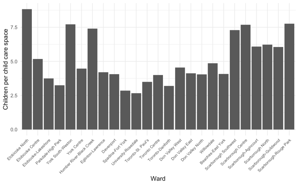
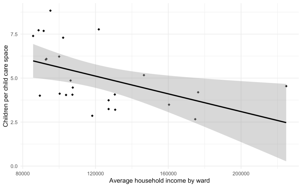
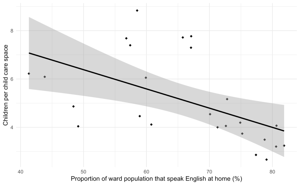
- Ward-level forecasting across service types supports more equitable and proactive allocation of city resources.
- Even moderate forecast accuracy can reduce reactive maintenance, overtime costs, and service backlogs.
Future Applications
Although transportation forecasting remains more complex due to irregular demand patterns, this project demonstrates how harmonized data and contextual modeling can shift municipal operations from reactive to proactive. The framework can be extended across additional divisions and integrated with collision data to strengthen public safety interventions—for example, by prioritizing pothole repairs in high-risk areas. We can also incorporate ward level demographics to study the reporting behaviour across financial income, immigrant population ratio, age of population and other key characteristics.
Next steps include developing an interactive application to surface these insights with a strong focus on operational pain points in city maintenance. This would involve incorporating financial data, contractor and builder performance data, and infrastructure lifecycle metrics to evaluate which service providers deliver the most value. Such an approach could support more transparent performance comparisons, improve planning decisions, and help ensure better utilization of taxpayer funds.
With thoughtful data cleanup, feature engineering, and predictive modeling, Toronto’s 311 data can evolve from a reactive reporting system into a strategic planning tool—supporting safer infrastructure, more efficient operations, and more equitable service delivery across the city.
I welcome collaboration and guidance on accessing relevant datasets or advancing the application development. Interested contributors are encouraged to reach out.
Bio: Hi, I’m Rahul Lal, a data analyst interested in how cities work. I enjoy digging into messy datasets, uncovering patterns, and finding ways to extract meaningful insights and showcase the real-world value of data.
Outside of analytics, I’m passionate about storytelling and community building. I enjoy writing fiction and am the founder of a local tennis community at Trinity Bellwoods, where I help engage people of all ages in competitive sport to stay active, connected, and healthy.
My Github repository: Rl16193/311_service_requests. The link to the datasets I used is shared here: 311servicerequests and Data