Blog article: Towards an updated Data Quality Score in Open Data
Article text
Why and how Open Data Toronto is updating its score to assess data quality
In 2020, we at Open Data Toronto started assigning and publishing Data Quality Scores (DQS) for a number of datasets. Now, in 2023, we’re updating some of the finer details of how we calculate and present these scores so to benefit data users and owners alike.
How it started
Way back when our portal started, we measured success in number of datasets; the more open datasets we had, the better we thought we were doing.
This was wrong for a couple reasons:
- Users don’t care how many datasets we have per se – they care about the datasets they want
- Having more datasets doesn’t necessarily mean more data is being used
- Data publishers thought that publishing more was key, and we worried this incentivized them to publish more datasets instead of better datasets
If we stayed the course of “more is better”, then we risked making a swamp; a catalog of hundreds of out-of-date datasets in less-than-open formats, with no metadata and no context. It would be like a huge library, but you can never find what you want, and most books are in a language you can’t even read.
Aiming to curtail this, we started assessing a basic measure of “quality” of our datasets. If you’re curious about our initial inspiration for doing DQS and how it worked, see the articles below for more:
- https://medium.com/open-data-toronto/towards-a-data-quality-score-in-open-data-part-1-525e59f729e9
- https://medium.com/open-data-toronto/towards-a-data-quality-score-in-open-data-part-2-3f193eb9e21d
In short, though, we started with evaluating 5 general “dimensions” of data quality:
- Usability – how easy is the data to work with?
- Metadata – Is the data well described?
- Freshness – Is the dataset up to date?
- Completeness – Is there lots of missing data?
- Accessibility – Is the data easy to access for different kinds of users?
We would evaluate the data based on those 5 dimensions, assigning it a score for each dimension. We would then sum those scores, weighing each dimension differently, to create a final score (out of 100) and grade (Gold, Silver, or Bronze) based on that score.
We would recalculate that score for every dataset we had in our database (which is not every dataset – some are stored in files – more on that later) every week and present the grade on each dataset page.
How it’s going – We changed how we calculate scores
We’re keeping the paradigm of 5 dimensions. This is largely for consistency’s sake, but also because the existing dimensions do a good job of organizing what we’re measuring. We did; however, change how each dimension was weighted.
We have changed the underlying metrics quite a bit; we’ve added some new ones and edited or removed some of the old ones. Dimension scores are based on the mean of all its metrics’ scores. The dimension name, its weight in the overall score, and the exact metrics being evaluated are below:
Freshness (35%)
- Has the data been refreshed on schedule?
- For example, if a dataset is supposed to be updated weekly, but it hasn’t been updated in 2 months, it gets its score penalized
- Has the data been left unrefreshed for more than 2 years?
Metadata (35%)
- Has all required metadata been provided by the data owner?
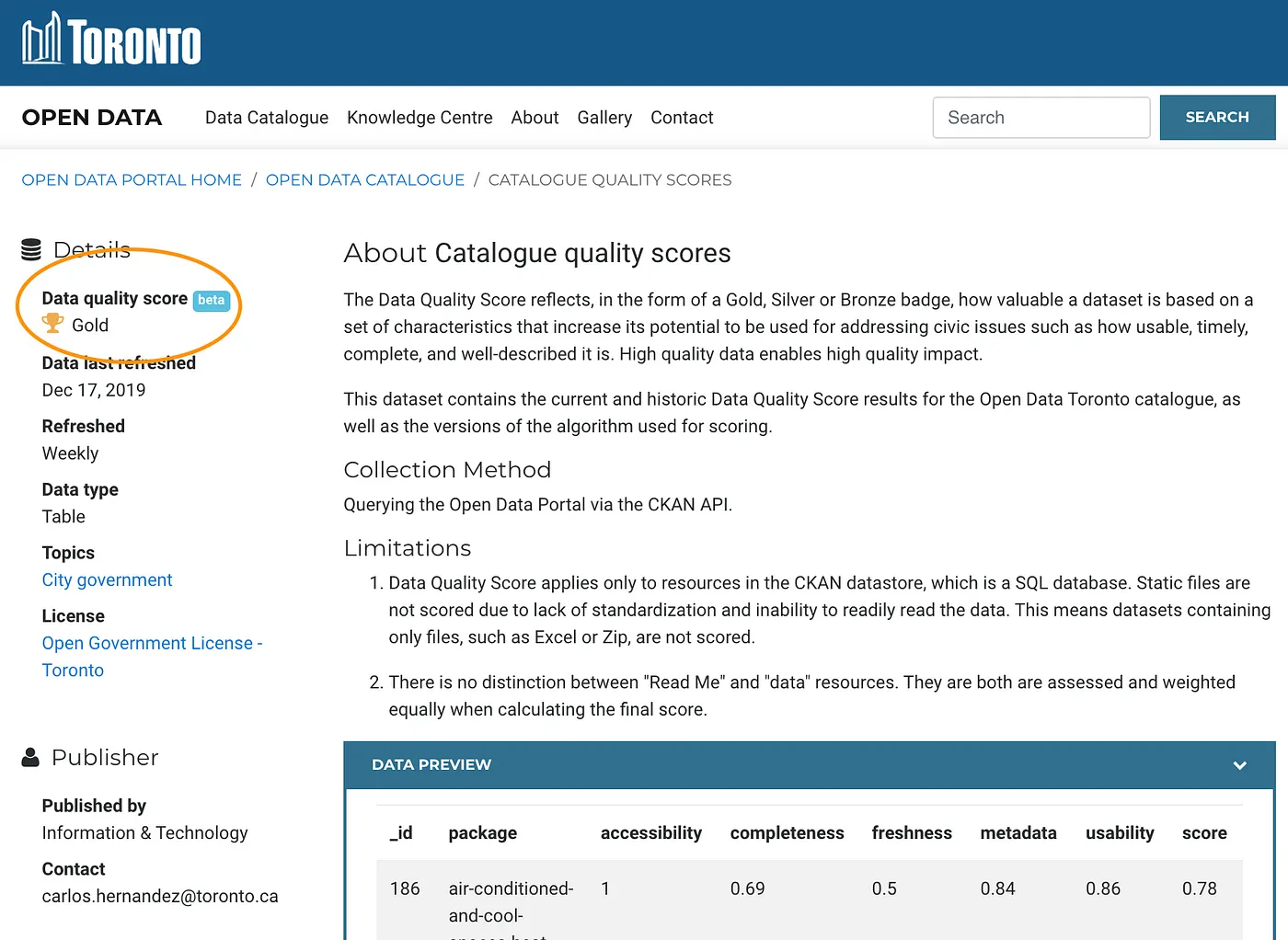
- To be specific, on the left hand side of each page we show some information about the dataset, like:
- Which division owns the data?
- How can this data be categorized in the context of our other datasets (is it about public health? Transportation? Parks and Recreation? Etc)
- Is there a website where users can learn more?
- And so on…
- If any of these are missing, this score gets penalized proportionally to the number of missing metadata
- To be specific, on the left hand side of each page we show some information about the dataset, like:
- Is the contact email associated with the dataset connected to the data owners team, or is it to a placeholder email like opendata@toronto.ca?
- Is the “Learn More” URL a valid URL?
- Are data definitions missing?
- Each column in a dataset has an English definition. If those are missing, the score gets penalized
Accessibility (15%)
- Are there any tags (keywords associated with a dataset to make it easier to find) on the dataset?
- We use these tags behind the scenes to help the search bar on our homepage find you the datasets you’re looking for
- If there are no tags, this score is penalized
- Is this dataset manually updated by Open Data or automatically updated?
- Some datasets, behind the scenes, stay up-to-date automatically. Others need to be manually updated by the Open Data team. This latter group gets penalized
- Is the data stored as a file or in the Open Data database?
- If data is stored in the Open Data database, our site can provide it to you in multiple formats and give you a preview of the data
- Data not in the Open Database will be penalized
Completeness (10%)
- Does the data consist of more than 50% null values?
- This is penalized based on the percentage of missing values, so long as that value is over 50%
Usability (5%)
- Do columns have meaningful names?
- Scores are penalized if less than 1/5th of columns have meaningful English components
- Scores are penalized based on the number of columns in the dataset
- Do columns have constant (each value is the same) values?
- If all of a single column’s values contain, for example, “NA”, the score is penalized
- Scores are penalized based on the number of columns in the dataset
The change in weight is important! Since our first iteration of the DQS, we’ve learned that users value the freshness and metadata of datasets a lot (no one wants stale data, and people want to understand data they’re consuming). For that reason, we made those dimensions responsible for the lion’s share of a dataset’s DQS score.
Similar to before, we assign the grade based on set thresholds:
- 80% score and above gets gold
- 60% to 79% score receives silver
- Everything else under 59% gets bronze.
We changed how we display scores.
Previously, each dataset page showed its grade. We’ve kept that, but we’re adding a new “Data Quality” section of the page, where we break down the details of why a dimension was given its score.
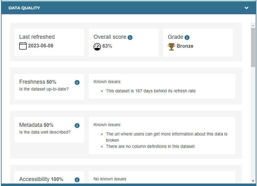
In this new section, we detail when the DQS was last refreshed, what its grade was, but also what its score was. Then, below that, we show each dimension score, its definition, and why the dimension was not scored at 100%.
In our initial user testing, a lot of people wanted to see information about metrics, thresholds, and weighting directly on the page, so we added it into info icons scattered throughout.
As we did before, we put all these scores together into a single “Catalog Quality Scores” dataset on our portal. It can be downloaded like any other dataset on our portal, and it contains dimension scores, and the reasons why scores weren’t 100%, over time.
We changed what gets a score
Before, we would only score datasets that were in Open Data’s database. If the data was only a file (it was labelled as a “Document” on our portal, and could only be downloaded in a single format) we would not give it a DQS. We changed that – now it will receive a score. It’s important to note here that Documents will be scored on only 3 dimensions; automatically scoring Completeness and Usability with files of a varying number of formats is difficult, so we put it out of scope.
Additionally, some of our datasets will have multiple downloads, or “resources”. We used to give a dataset an overall DQS, but now we give each resource a DQS.
Who is DQS for?
We made DQS with the data consumer in mind, for sure. However, this newer iteration of DQS also considers the data owner, too.
You’ll notice that some of the new metrics, while insightful for data consumers, aren’t always actionable for data consumers. Take the example of a broken “learn more” URL. Sure, it’s good to know, but it probably won’t change how someone uses the data once they get their hands on it.
The data owner, though, will now have this identified for them once it occurs. Additionally, we think the idea of improving public-facing scores and grades will incentivize data owners to keep data quality high.
Finally, this metric is for us at Open Data Toronto, too. The “Catalog Quality Scores” dataset mentioned above will let us monitor data quality over time and identify trends in where data quality issues are. We’re hoping that if we identify trends now, we can get ahead of them in the future.
Thoughts for future iterations
We know this won’t be the last version of DQS. There are so many ideas that we knew we wouldn’t be able to stuff into this deployment. These include:
Reusable DQS Logic
Our logic 100% can be reused by anybody – there’s nothing unique about it, and we share it on our GitHub. Because the code is tailored to Open Data Toronto’s environment, though, you can’t really copy-paste/fork much of it.
We considered turning this code into a CKAN extension so that other organizations that leverage the same portal backend as us (province of Ontario, Government of Canada, and dozens more) can also reuse our DQS easily.
DQS over Time
We currently track DQS for each dataset over time. However, we don’t visualize this anywhere on our portal. We’d love to add this so that both owners and consumers can get an idea as to whether a dataset is collecting dust or being kept evergreen.
Considering Popularity/Usage
We currently track dataset usage on our portal. However, we didn’t integrate those statistics into how we calculate DQS. In our heads, it was tricky to balance the importance of how “clean” or “up-to-date” a dataset is versus how popular it is, and then combine that into a single, coherent score… especially one that would enable data owners to improve their data. That being said, we would like to make that dataset usage more visible to our users, be it as part of the DQS or otherwise.
Measuring if a dataset can be combined with others
This is a computationally expensive and somewhat complicated idea, but we know it’s possible. If we could integrate foreign key analyses between attributes in many datasets, it would be a really useful metric, either for DQS or otherwise.
We have to emphasize that we know this would be a tall order. However, getting this kind of information gives us line of sight on value-adds to data, and would let us enable our users to make simple data models based on our catalog. Finally, this would be a useful tool for us to identify datasets that are related to, or even duplicates of one another.