Blog article: How Fast Can You Go Places Using the TTC?
Article text
Welcome to our newest blog post, where we’re exploring a game-changer in Toronto’s public transit scene! Meet time2reach, an interactive transit map created by university student Henry Nguyen. This clever tool uses data from Open Data, including TTC Routes and Schedules, along with information from other regional transit agencies, to give you the best travel routes and times across the city. From Scarborough to Clarkson, time2reach makes navigating Toronto’s public transit system a breeze. Whether you’re a daily commuter or just planning a day out, this map is your new go-to guide. Join us as we delve into how this innovative map is simplifying travel in Toronto! Written by Henry Nguyen.
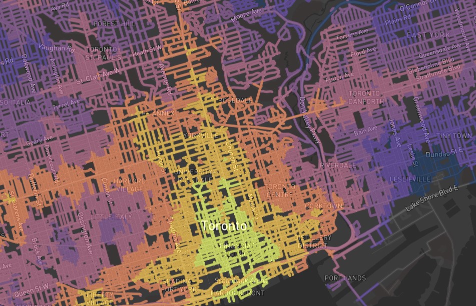
Time2reach is a map that shows you how fast you can travel from a place using public transit. The more “yellow” an area is, the quicker you can reach it from your starting point. Hover over any point to see which trains or buses you need to take to get there. The default starting location is at Union Station. To change the starting point, double click anywhere on the map. The map updates to show commute times from your starting point.
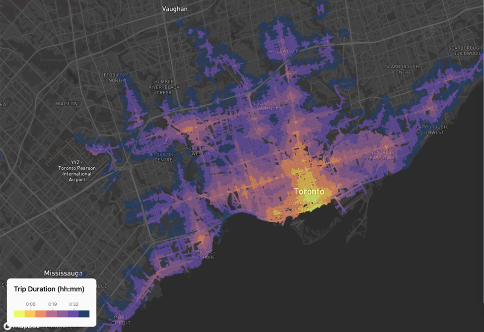
Just for fun, I included a few filters that let you choose your mode of transit. For example, if you want to exclude Pearson Express and GO trips, then you can deselect the agencies from the right menu. The resulting map without GO Transit looks like this:
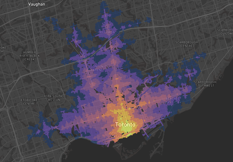
As another example, to see where you can go from Sheppard-Yonge without using any subway line (e.g. Line 1 is down), then you can also unselect the “Subway” mode.
The resulting map looks like this:

There are a lot of other filters for you to play around with as well! For example, you can change the time (midnight transit options are different!) and adjust the maximum duration of the trip as well.
Just for fun, I also tried to make an animation of the transit access map over the course of a day. I thought it’d be interesting to see how transit changes around our commuting patterns. Here is the 24 hour animation for Toronto.
If you noticed the ~15 minute blips at Weston / Pearson Airport, that’s because of the Union Pearson express! The trains have a 15 minute frequency, so it’s extremely quick to reach Pearson Airport if you time the train just right. You might also notice lower frequency blips near the GO Stations in Mississauga or on the Lakeshore line. If you time your departures just right to catch the train, then it’s extremely fast to reach any station along the line.
Just for comparison, here is a similar 24 hour timeline for New York City.
The animations show the “heartbeat” of each city. Frequent rapid transit makes large distances feel small. It’s also cool how this perceived distance changes over the course of a day. The Finch area is normally very accessible, but not past midnight when the trains stop running. But above all, the animations show how transit infrastructure connects neighbourhoods. This is the best evidence for running buses and trains more frequently, or for 24-hour transit. The city literally becomes farther without transit.