About Sidra Mahmood

As a User Experience/User Interface designer, Sidra uses code, research, and visual prototyping to design and develop digital solutions for the Open Data program. With nearly a decade of experience working with open source and user-centered design to build civic and community-minded digital projects, Sidra is passionate about open source and accessible governance. Some of Sidra’s notable projects in Open Data include developing the new Open Data Beta Portal, designing the Open Data Program’s brand strategy and communications collateral, and creating the visual layout for the Open Data Master Plan.

Guest Post: Using Folium to Visualize Distribution of Public Services in 140 Toronto Neighbourhoods

Lisa Chen reached out to the open data team with the visualizations she created from two open datasets: Toronto Neighbourhood Boundaries and Youth Wellness Resources. We really enjoyed Lisa’s data story which guides users through visualizing the data using a library called Folium. We’ll let Lisa take you through the rest in “Using Folium to Visualize Distribution of Public Services in 140 Toronto Neighbourhoods.” Read article on Medium
...

About the author

Lisa graduated from the University of Toronto with a degree in History and Computer Science, and she currently works at a Home Management Startup in Toronto as a Data Insights Strategist. Lisa is passionate about using data to tell stories and derive compelling insights that will hopefully improve our lives and organizations. She believes that coding is the ultimate super power of the 21st century. In her spare time, Lisa enjoys travelling to far off regions of the world, hiking, and reading biographies.

Find Lisa on LinkedIn.

New open data products support data access and literacy

Improving data literacy and access

“The new open data products bring value to the Public Service and residents alike, enabling access to meaningful data that can be used to better understand and tackle the issues we all face as a community” – Councillor Paul Ainslie
We’re excited to tell you all about the newest changes to Toronto open data. In addition to a portal facelift, we’ve just released a series of tools designed to help improve data literacy, improved access to open data, and directly connect datasets to important social issues like climate change.

1. Data Quality Framework

screenshot of data quality scores 
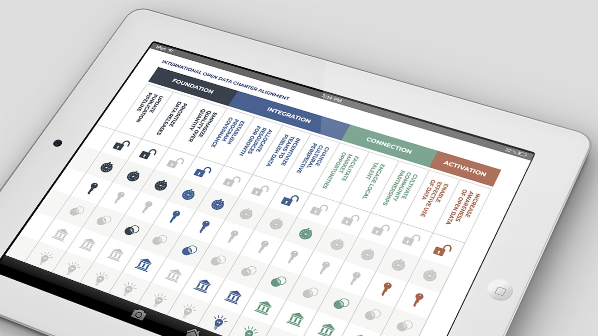
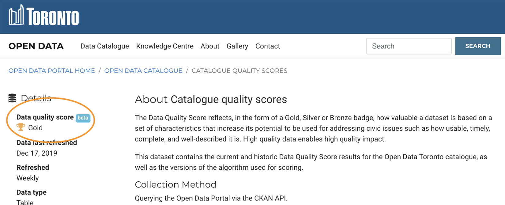
Data science can be complex! Simply providing data to our users doesn’t always solve their pain points, given that not all data sets are created equally. Data quality is integral to uptake, so we’ve introduced the Data Quality Framework. The Data Quality Scoring Framework displays a Gold, Silver or Bronze badge per dataset, which helps measure the potential impact a dataset has to help address civic issues. A high quality dataset enables high quality impact, as it has the characteristics that makes it easy-to-use, comprehensive, timely, and relevant.

2. Civic Issues

Giving data context is an integral way to create change. We’ve now introduced Civic Issue Tagging, which allows users to search and filter datasets that align to the City’s priority areas: mobility, poverty reduction, climate change, fiscal responsibility, and affordable housing. civic issues filtering screenshot
“Civic Issue tags bridge the gap between policy-makers, activists and researchers and access to high-value datasets that enable and empower better decision-making” – Councillor Paul Ainslie
Today, 67% of current open data contributes to addressing civic issues. To search datasets by civic issues, visit the catalogue on the Open Data Portal. Learn more about how the City prioritizes the release of datasets that align to civic issues.

3. Google Sheets Plug-in

screenshot of google sheets open data plugin 
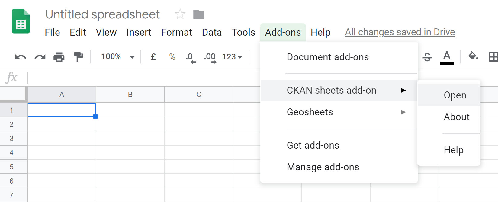
Not a data scientist or API expert? Don’t have access to data analysis software? Not to worry. The new Google Sheet Plug-in allows the public to access City of Toronto open data directly within Google Sheets. This plug-in eliminates the multi-step process needed for a user to access the Open Data catalogue, navigate to a dataset, download it, and upload it manually to a data application. We think this plugin is a great addition to the publishing cloud because of how simple it is. It enables a broader range of users to access the most current version of available open data, particularly those wanting to work with data but have limited technical knowledge. This plug-in was developed in partnership with the community, and is a successful demonstration of co-creating public services with the public. To-date, the Open Data team has contributed $43,000+ back into the community through co-development and micro procurement. Want to see for yourself? Instructions on how to access and install the add-on are available here.

2020, here we come!

We’re eager to share what’s in store for 2020. For more about open data, follow us on Twitter @open_to, send us an email to opendata@toronto.ca, or subscribe to our monthly newsletter.

Open Data: A product approach

What is open data? Believe it or not, this is a very common question, and rightfully so. Many people are unaware of the decade long open data movement that has been going on in Toronto, longer elsewhere in North America. Governments around the world are making an effort to make data available to the public free of cost under an open license. There are many reasons for this, such as:

  • enabling economic opportunities
  • improving operational efficiencies
  • increasing transparency
  • stimulating innovation

With such noble intentions why are so many people unaware of the open data movement? One reason could be the initial target audience, application developers. The early days of open data in Toronto focused on releasing data with the hope that software applications would be developed to improve social services. While there have been some successful applications developed from the City of Toronto’s open data (see our gallery) the level of application development did not reach the desired level, meaning the positive news and linkage that would accompany the promotion from an app did not occur. The second, and maybe the more likely reason, people are scared of data. The majority of people do not search out data for the sole purpose to perform analysis or to build software applications.

Keep reading “Open Data: A product approach” on Medium

Top Open Data Moments in 2019

top ten moments in 2019
 

1. The Open Data Update

  Toronto Open Data started releasing a monthly email update in early 2019. We wanted a way to mark the end of each month with an overview of what the team has been working on, and to share our work with the wider community outside the curved walls of City Hall. The newsletter also gives us valuable insight into the types of users interested in our work. Subscribe to the monthly open data update (no longer available) to learn about upcoming events, publications, and opportunities to get involved!

2. A new home for open data

We spent 2018-2019 working extensively on our new portal. We evaluated the portal’s user experience as we went along, tailoring it to our users’ unique needs. Once we had enough evidence supporting the value of our new portal, we were able to migrate from the sandbox to our new home: open.toronto.ca While a domain change may not seem like a big deal, it’s pretty meaningful. As a result of this migration, we’re seeing significant growth in visits to the portal, total downloads as well as user engagement. Our users tell us that the new domain makes it easier for them to find what they’re looking for, which increases their uptake of open data.

3. Committee motion

Thanks to the efforts of key open data advocates like Mark Richardson, CTO Lawrence Eta, and Councillor Paul Ainslie, a committee motion was passed in May 2019 “[to] publish all historical and current data embedded in documents, reports, or any digital artifacts that are available publicly on the City of Toronto’s digital infrastructure to be made available on the City’s Open Data portal”. This is an exciting time for open data!  We have to add the bulk increase in dataset submissions in 2020 as a result of this motion may create a slightly longer waiting time for new releases.

4. Dataset Quality Score

screenshot of data quality score on a sample dataset One of our 2019 priorities was establishing the new Dataset Quality framework. We parsed all of the datasets presently listed on the open data portal and assigned each one a quality score. If you’re interested in how we analyzed and scored the datasets, you can read all about it here: Towards a Data Quality Score We evaluated quality score based on a number of important criteria, including completeness of the data, machine readability, usability, completeness, etc. This allows us to not only encourages improved data quality and consistency with our partners, but also ensures that our upcoming dataset releases align with what we’ve heard from the public. The open data portal is, ultimately, a public service tool, so it’s essential that we ensure we deliver a high level of standardization and data quality to best enable users to work with it.

5. Getting meta with Dataset Quality

As a partner piece to the data set quality score, we also decided to create a publicly available dataset that can be used for further analysis as well as for visualization purposes to better understand the ‘health’ of our project and program. You can access this data here: Dataset Catalogue Quality Scores. Let us know if you do something interesting with it, and your work just might be featured on the open data portal!

6. Dataset Priority Framework

To help us be more strategic in the way that we identify and release open datasets, we created our very first data prioritization framework. This is an algorithm that helps us assess and ascribe a prioritization score for a dataset based on multiple factors. Together, these considerations will enable us to better prioritize the release of high-quality, in-demand open data. More details on the framework can be viewed here: Open Data Priority Framework.

7. Civic Issues Campaign

We launched a Civic Issues campaign to align dataset requests with key City priorities. We asked the public what data they need in order to tackle these key civic issues, including how it will be used and how it aligns to key civic issues/priorities. Each request submitted through the survey was measured against a recently developed priority framework, which uses an algorithm to determine which datasets are the most important to release. The raw data from the survey will be shared publicly, along with a list of which dataset requests we will start releasing, as a result of this survey in 2020.

8. LVQ: QGIS, R, Google Sheets & Visualizations

screenshot of google sheets plugin One of our favourite initiatives in 2019 was the release of four LVQs. An LVQ, or ‘lower-value quote’ is a request for proposals for smaller-sized projects that don’t need significant funding or resources, so we can pitch for solutions within our open data developer community and funnel some funding into smaller scale open data projects. Our mandate of making our products publicly available stands, which means that the global community benefits from our open source releases. We’re thrilled with the deliverables, which include Evert Pot’s Google Sheets Add-on, Sharla Gelfand’s R package for open data, QGIS location mapping by BergWerkGIS, and a soon-to-be released CKAN visualizer by open source consultancy Keitaro.

9. Sharing with our friends down under.

Speaking of sharing, we were excited to have the first jurisdiction use our open source docker container to build their own CKAN-powered open data portal. This is pretty exciting, as it means other municipalities can harvest our work to build better open data communities across the world.

10. Reddit AMA

screenshot of reddit In August, we were hosted by the very active online community /r/Toronto (181,000 individual members!). We spent the day answering questions from the public in the AMA (“Ask Me Anything”) format, and we were thrilled with the engagement we got from our users. You can browse through the AMA here: We are the City of Toronto’s Open Data team! Ask us anything!
That’s a wrap for 2019! Wishing you the best successes this new year. the open data team gathered around lunch The Toronto Open Data Team

What the @#%! is a Shapefile?

We’re excited that you’re taking the plunge into open data! We’re assuming that you want to explore and/or work with the many open data files available in our data catalogue. We aren’t officially endorsing anything you find here as the “tool of choice” or “best tool”, etc, so your mileage may vary. That being said, we’re especially interested in ensuring that technical knowledge and price aren’t a factor when it comes to accessing our datasets. As such, we’re sticking with recommending FOSS (free and/or open source) solutions to help you learn more about how to work with open data files.
CSV file preview

CSV

What is it? Comma Separated Values. Why would I use it? Creates a very lightweight file with a standardized notation that can be opened in most spreadsheet programs. What does it look like? Text with values separated by a delineator, like a comma or semi-colon How do I open it? Google Sheets, OpenOffice Calc, Excel , Charts for Mac

CSV file preview

XML

What is it? eXtendable Markup Language Why would I use it? Another lightweight file. XML files can be opened in almost any program. What does it look like? Text with values separated by a delineator, like a comma or semi-colon How do I open it? Open Office, LibreOffice, Google Sheets, Microsoft Word , Pages

CSV file preview

SHP

What is it? ESRI Shapefile Why would I use it? It’s a common geospatial format, so it’s ideal for mapping. What does it look like? A shapefile is a set of related files that store location, shape, and attributes of geographic features. How do I open it? GQIS, ArcReader, ESRI ArcGIS

CSV file preview

JSON

What is it? Javascript Object Notation File Why would I use it? Creates a very lightweight file with a standardized notation. The focus is on the data! What does it look like? Text with values separated by a delineator, like a comma or semi-colon How do I open it? Open Office, LibreOffice, Google Sheets, Microsoft Word ($), Pages ($)

CSV file preview

ZIP

What is it? Zipped (compressed) file Why would I use it? Imagine stuffing a suitcase to the brim and zipping it shut. A Zip file compresses your files so that they take up less space and can be transferred faster. What does it look like? A folder that you open up to reveal more files and folders inside. How do I open it? On most operating systems, you can right-click and hit “unzip” , “unarchive”, etc. You can also use the same technique to zip up a collection of files and folders.

CSV file preview

RAR

What is it? RAR Compressed File. It’s essentially a special Windows-version of a ZIP file. Why would I use it? To zip up and condense files for faster and easier transfer when ZIP isn’t available. What does it look like? A folder that you open up to reveal more files and folders inside. How do I open it? WinRAR , desktop utility

CSV file preview

GeoJSON

What is it? The geographic version of a JSON file Why would I use it? Allows you to encode a variety of geographic data structures, and allows you to include values like point, linestring, and polygon which are essential for mapping. What does it look like? Exactly like a JSON file with some additional geography-specific values How do I open it? Most mapping and GIS software packages, like ArcGIS , Leaflet, and Google Maps.

CSV file preview

DOC, DOCX

What is it? Word Document Why would I use it? Because it’s hard to escape. What does it look like? A formatted document with text and images inside it. How do I open it? Microsoft Word , OpenOffice, LibreOffice, Pages , Google Docs

CSV file preview

PPT, KEY

What is it? Powerpoint Presention / Keynote Presentation Why would I use it? To create a slideshow or slide deck What does it look like? Multiple slides with images and/or text How do I open it? Powerpoint , Keynote , OpenOffice, Google Slides

GKPG

What is it? GeoPackage Why would I use it? It’s an open data format so it’s free to work with. It’s used widely in the mapping world. What does it look like? A lightweight, ready-to-use file with an SQLite database container How do I open it? In your browser, directly from the URL, and in most mapping and GIS packages (see SHP).

Powering open data with civic issues

Hey Reham! Let’s start by telling our readers a little bit about you and your role with Toronto Open Data. I’m Reham Youssef. I’m the Marketing and Communications Lead for the open data team, and I’ve been with the City for over fifteen years but in the last ten years, I’ve really been focusing in on open data. Tell us about the project you’re currently working on. Sure. At open data, we always want to know: what do users want? In the past we would accept dataset requests through email and twitter on an ad-hoc basis. We didn’t really have a concise way of gathering data from the public on what they want when it comes to open data and we’ve been trying to establish different criteria that will help us evaluate and prioritize dataset releases. The Mayor recently announced three new city directives. We took that list and identified two more: climate change, which is an important global issue right now, and poverty reduction, which we heard as a consistent theme from the civic tech community. This gave us a list of five total civic issues we wanted to prioritize dataset releases around: affordable housing, poverty reduction, fiscal responsibility, climate change, and mobility. We’re now considering the impact of these civic issues in determining what we release next. Why is it important to know how to prioritize what datasets get released? It’s just a better way to understand data requests, and we wanted to make sure that incoming data requests align as much as possible with these priorities. We can’t release everything at once. Unfortunately we have limited resources and (wo)manpower, and we also have to work with 44 different City divisions. As you can imagine, there are numerous units within the individual divisions that are responsible for data. When we prioritize data, we link it to the city priorities which you can then narrow down to 5 to 10 divisions, which makes it much easier for us to discuss with those divisions instead of all 44. Often times it’s tricky to ask for data when we don’t even know how or where it exists, let alone if it exists in the first place. So we decided to focus in on the most important things for the city. We want to establish a consensus on what users want, and specifically go after that data. Great! So you started by developing a survey that would be filled out by users to inform what civic issues and datasets they wanted. How did that go? Well, when we first went out the door with the initial civic issues survey, we unfortunately didn’t get what we were looking for the first time. Why is that? There were just too many questions, and we were asking for too much detail at the time. People didn’t understand how to respond. We really wanted people to tell us as much as possible, right down to the data attributes, and exactly what they wanted. We started to see that while people know they want to solve problems like affordable housing, they don’t always necessarily know what data they need to address that problem. So what did you do when you found that users weren’t filling out the civic issues survey as expected? After a month, we took the survey down and switched things around. That’s how we got to the second questionnaire, where we simplified it down to 3 simple questions. The wording had to change for people to think differently, and asking people what they wanted and what they wanted to do with the data was the main driver. The reason we asked for what they will do with the data is because of a fun little algorithm we created that I’ll go into detail later. What was the result? Unexpectedly, we were overwhelmed with responses! 875 in total. We received enough information from our users the second time around that we could plug right into the prioritization framework. This gave each dataset request a score as well as informed us as to how many people were asking for the same data in different words. Can you tell our readers a little bit about the prioritization framework? The prioritization framework was developed by the open data team as a way to assess and prioritize upcoming dataset releases. The algorithm was developed by Ryan Garnett, who manages the open data team as well as the geospatial competency center (Editor’s note: Ryan writes frequently for the Open Data Knowledge Center; you can read his articles here) in the form of a dynamic spreadsheet. The framework focuses on five outputs. Each output is given a specific score. The algorithm applies a weighting to all these scores and then outputs an overall ranking. The primary assessment metrics are:

Source

Is the data in a database somewhere or is it in a spreadsheet on someone’s desktop?

Civic Issue

A dataset request that isn’t related to one of the five main civic issues would receive a lower score than one that does.

Requester

Who requested the dataset? Is it requested by council or a member of the public? Different requesters are given different scoring.

Output

What will it be used for? Education? Media? Government city report? Is it for research? Will it be used to create a by-product, like an app?
So the framework lets us figure out where the priority lies for every request. The higher the number, the more we will focus in on getting that data from the appropriate division or unit. Do you think the scores will be made public anytime soon? They’re already public but they aren’t presently linked to the prioritization framework! We’ve got a few more things to do first. We’re reviewing all of our requests, separating one single request perhaps into two or more data requests, manually tagging them with topics or themes and separating them out by civic issue. We’re actively working on releasing that data to the public in a raw format. It’ll contain every single request with the requester listed. What is the benefit of releasing that data to the public? It’ll be our first actual open dataset from open data. Data about the data! Yes, exactly. This will give people the opportunity to take a look and play around with the data. We’re going to analyze the data and figure out how many requests there are based on tags. We’ll plug each one into the framework, then come up with a score that we then report back to the senior management team (SMT) or appropriate division. That we hope to release soon, publically, and ultimately this is how we want to report back. That seems fairly well-aligned with the mandate of open data, which includes transparency as well as data-informed decision making. That’s right. So what are your next steps as this seems like a fairly mammoth undertaking. We’re going to clean the data for the release. My personal next steps are to perform a little bit of an analysis so we can have a cool data story to report back with. I’m not a data scientist, so I’ve never worked with so many sources before, but I’m excited to venture off and try this. I want to have some sort of summary story that tells us the total number of requests, unique tags, and breakdown of civic issues. Ultimately we want users to understand how we took nearly a thousand requests and categorized them with tags and top civic issues. Thank you, Reham, for explaining the open data civic issues campaign and prioritization framework. We welcome reader comments and questions to opendata@toronto.ca.

Strategies for working with new data

Introducing Community Data Stories

We’re excited to present our first community data story by Sharla Gelfand. These data stories feature articles by active members inthe greater open data community who’ve done something interesting with our data. We want to highlight the diversity of meaningful work different users are creating and contributing using Toronto open data. Read “Strategies for working with new data”

About the author

Sharla is an R and Shiny developer and co-organizer of R-Ladies Toronto and the Greater Toronto Area R User Group. Her work focuses on enabling easy access to data and replacing manual, repetitive work with reproducible and future-proof processes in R. Outside of R, Sharla is an eyeshadow aficionado, a shiba inu owner wannabe, a bass player, and a cyclist.

Ask a Data Scientist: Ryan Garnett

We sat down with open data team manager Ryan Garnett to ask him a few questions about what traits make a good data scientist, what his favourite resources are, and words of wisdom for newbies.

Q1. What do you think makes a good data scientist?

Passion. Data science is becoming one of those terms that means something to everyone, like love. Because of that I thing you really need to love solving problems, looking at things differently, bring a diverse perspective, and most of all, be weird and own it.

Q2. What will you say the “best practices” in data science right now?

Delivery and communicating value. You can build a wicked machine learning algorithms, or have an AI predict with >95% confidence, but if you can communicate why it is valuable in a tangible outcome deliverable, then that work has minimal benefit.

Q3. What publications, websites, blogs, conferences and/or books do you read/attend that are helpful to your work?

This depends on which part of my data science journey. As a leader of a team my role is much less technical, however I do drink the R koolaid. I read a fair amount from R-Bloggers as it is a good mix of technical and project. Conferences aren’t really my thing, as I personally do not get a lot out of the experience. However I do watch a lot of YouTube, but not what you expect. I tend to watch thought provoking topics, such as the future of jobs and climate change. I find by watching these videos I am able to be creative and link how data and analysis can help to benefit society. As for books, story telling with data by Cole Nussbaumer Knaflic is a must read for everyone.
“I find by watching these videos I am able to be creative and link how data and analysis can help to benefit society.”

Q4. What are the biggest areas of opportunity / questions you would like to tackle?

Data literacy. Governments and organizations are focusing on teaching people to code. While good I feel educating society on data, what it is, why it’s important, what it can do, and how to work with it is fundamentally important. Improving data literacy will raise the global profile of data science, as well as make the daily activities for data scientist easier as both senior executives and the team at whole will understand and respect the power of data.

Q5. Any words of wisdom for Data Science students or practitioners starting out?

Humility will take you far in your career. In many organizations you will work with people who have a limited data and analytics background, don’t overlook the experience and knowledge they have achieved and how it can benefit your work. Your career will foster and explode if you position yourself as the bridge between the technical data science team and the business, communicating what’s possible, the value, while keeping everyone honest about the technology.

Measuring Walking Times Across Toronto to Nearest TTC Stop

Matthew Tenney (@terra_tenney) is our first guest contributor to Data Stories. In this tutorial, we analyze walk times from every address point within the City of Toronto limits to the closest Toronto Transit Commission (TTC) Stops. TTC stops can include subway, LRT, street car and bus. The analysis uses Pandana to perform the network distance calculations on a new open data set called the “Pedestrian Network” that our team created in conjunction with Transportation Services to better understand walkable access to various amenities across Toronto. 
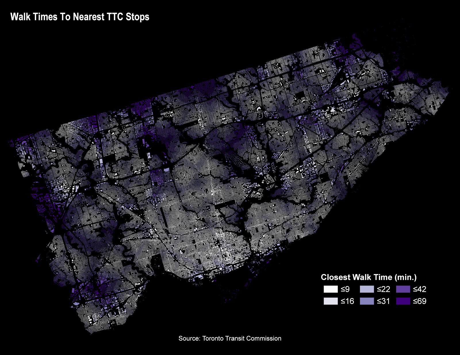
Read Measuring Walking Times Across Toronto to Nearest TTC Stop Using the Pedestrian Network and Python on Medium.

Ready for Primetime!

On July 25th 2019, we’ll be waving goodbye to the old open data catalogue on toronto.ca/open. Please update your open data bookmarks and links:
  1. Remove any bookmarks and links that begin with: http://www.toronto.ca/city-government/data-research-maps/open-data/open-data-catalogue https://portal0.cf.opendata.inter.prod-toronto.ca
  2. Visit the Open Data Portal at open.toronto.ca to find your equivalent bookmarked page.
  3. Note the web address as the replacement URL for your bookmarks and links.
cutover

Dataset Readiness Criteria

Toronto’s open data team is working hard to make preparing and releasing open data easier, faster and more efficient than ever. Over the last year, we researched and developed guidelines to improve the quality of our data. To do this, we assessed all 290+ datasets on the the current portal to come up with a set of evaluation criteria. These six criteria assess how close to ready a dataset is for automation and optimization. We are working with data stewards across the City to ensure that our data provides value. Each criteria, and a brief description of what it means is below.

1. Source System Connection

A source system connection refers to how a user accesses a data source. There are many benefits to having a source system connection for your data instead of a static file (eg. Excel spreadsheet). For one, the SSC serves as a “source of truth” for your data, so data stewards no longer need to update many different file types. Some datasets are very large and difficult to download efficiently. Others include more information than a user needs. The open data team will help guide City data stewards who don’t already have an SSC to set one up for their open dataset.

2. Open Data Readiness

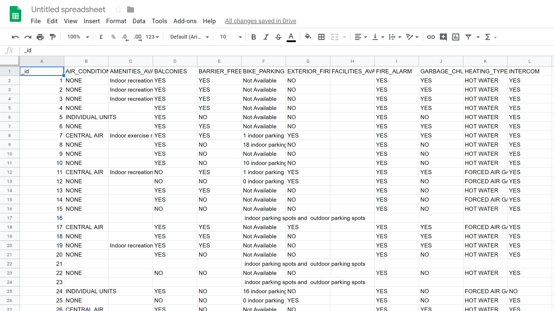
An open dataset must readily import into data visualization and analysis tools like Tableau or PowerBI. Examples of these open file formats include CSV, JSON, XML, and GeoJSON. File format alone isn’t the only factor that make datasets machine readable. The structure of the dataset also has implications on the dataset’s readiness.  The Open Data team will work with data stewards to improve the open data readiness of datasets to best make them machine readable. 
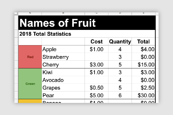
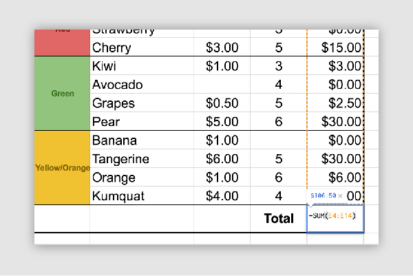
Structural improvements include removing merged cells, formulas, and summary data. Style elements like colours, font, and formatting should also be removed. They can in fact hinder the machine readability of your data. 
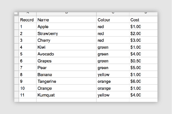
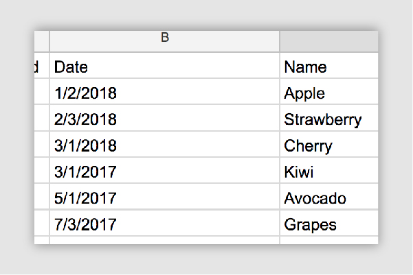
Formulas are also an important consideration. Open dataset files should be free of them. As a general rule, the first column of every row in a document should be a heading that describes the values in the column. Each row in a dataset should describe a single data entry.

3. User Demand

hand outstretched We want to make sure that when data is requested, that data stewards are ready for it. By looking at site analytics, search terms, as well as current events, the Open Data team can get a general sense of how ‘in-demand’ a dataset is. Although a dataset may not have many hits on the Open Data portal doesn’t mean that it’s not important or relevant. We also consider requests for datasets as an important factor.

4. Freshness

apple 
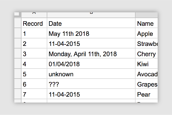
Data freshness refers to not only how often a dataset is updated, but how accurately the metadata represents the refresh rate. For example, if a dataset says that it is updated on a weekly basis, but the last data entry was 8 months ago, the dataset would have a lower rating. Please note that it is possible for some datasets to be updated less consistently by design. An example is a survey or evaluation that occur every 10 years. Regardless, it’s important to ensure that metadata correctly represents how often a user can expect to see updates.

5. Data Granularity

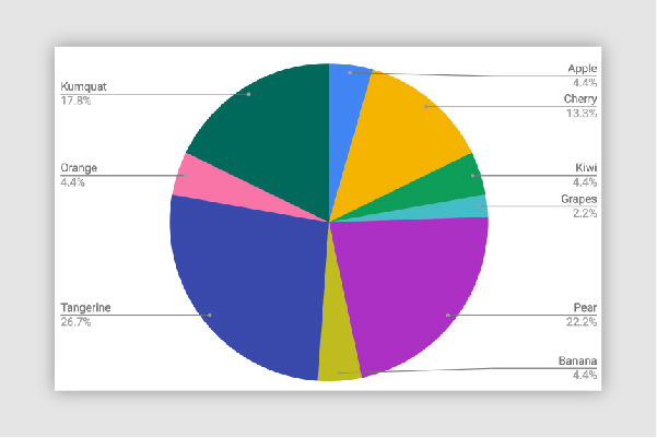
Data should always aim to be as detailed as possible. Data should be non-aggregated and only provide raw values. This will allow users to visualize and analyze the data as they need. When raw data is provided. as opposed to summary data (e.g. totals),  this makes it easy for users to use the data in innovative and creative ways. Aggregated data may be provided on a case-by-case basis. This would include situations where it is impossible to report on granularity for privacy, technical, or legal reasons.

6. Proprietary Formats

A majority of the current open data catalogue is only available in proprietary formats. Proprietary formats, such as Excel Spreadsheets, are file types that are the property of a particular software company like Microsoft. This limits who can access the data, as the end user typically requires a paid software license to open these files. In some cases, the files may not render correctly in visualization tools. Luckily, there are many universal open formats that can be substituted that do not require special software to open or access, such as CSV. That’s why we will be moving to publishing in open formats only.

The Open Data Update (this newsletter is no letter functioning after 2020)

The Toronto Open Data team is excited to share our newest release: the Open Data Update! Subscribe now and receive monthly updates on new open data releases, upcoming events, and more. We promise never to spam you.

Submissions

Have an idea for an upcoming issue? Let us know! Email opendata@toronto.ca with your questions/ideas/suggestions.

Read previous issues:

(No links provided as this was discontinued)
  • Open Data Update #6 – September 2019
  • Open Data Update #5 – August 2019
  • Open Data Update #4 – July 2019
  • Open Data Update #3 – June 2019
  • Open Data Update #2 – April 2019
  • Open Data Update #1 – March 2019

Civic Issues Initiative

In this four-part series, we introduce our readers to the Civic Issues campaign. This campaign highlights some of the most important socio-political issues impacting Toronto residents, including hot-button items like housing affordability and poverty reduction. The Civic Issues Initiative survey
What do civic issues have to do with open data? It turns out, quite a bit. It’s important that open data releases reflect the concerns and interests of the city’s residents. Releasing in-demand open data is one way to increase community participation in civic tech, increase data literacy, and activate data-driven decision-making. Solving complex civic problems means ensuring there is a seat at the table for underrepresented voices. Join us as we take you through how we are improving the way open data is created and shared in the city to bring you more of the data you want, when you want it.

How do we currently acquire data requests?

Since the start of Toronto’s Open Data program in 2009, we’ve used many ways to determine what to publish, and when. Some of these ways include keeping tabs on formal and community requests through our e-mail inbox, public consultations, and requests from the media. Once we’re alerted to a dataset request, we connect with the appropriate division to find out if they have the data that’s being asked for, and assess how much effort is involved in acquiring it prior to publishing it. The Open Data team has a highly engaged following on Twitter, which has served as one of the primary ways in which the community can tell us about what they’re interested in. We also track current events and the media to establish the demand for a specific set of related information. We recently launched our monthly newsletter as well, The Open Data Update, which encourages our readers to contact us with requests for data.

Following a request, how is the data acquired?

City divisions like Transportation Services or Parks, Forestry and Recreation can periodically provide us with a ready to go real-time data feed, but not always! A lot of this data is subject to the technical limitations of the time at which it was collected, so much of it is buried. Even when we have access, the formats might be out of date, and there might be issues with consistency. We see these issues in many of the datasets currently hosted on open data. This means that the data would need to be cleaned up, undergo an extensive privacy review, and/or need to be digitized prior to release. It’s a lot of work. There are an estimate 9 petabytes of data in the City, and not all of it can be made open due to privacy, licensing, or technical restrictions either. So it’s essential that we prioritize our releases based on the value their provide to service provisioning.

How does all this relate to civic issues?

As a civic campaign, we’re obligated to demonstrate the socioeconomic value of open data in our reporting. Like other cities, we struggle with demonstrating the true social value of the data that we provide. Many times, we aren’t able to truly demonstrate just how impactful open data can be to a typical resident of the city. It can seem too technical or too bureaucratically inaccessible. How do we change this perspective, and democratize access to open data? Let’s consider some non-technical challenges. Often, the decision-makers in the room don’t usually represent the groups we need to provide services to the most. These are groups with limited data literacy, limited mobility, or economic insecurity. Lived experience is often the best way to understand the unique experience of someone who may be under-housed, or struggle with transit affordability. We need to make sure that we don’t overlook the importance of these communities, and so we want to prioritize the release of data that can positively influence change and provide opportunities for improvement. Evidence shows that decision-making models that involve affected communities and prioritize their needs are typically the most sustainable and scalable.

How do we understand social value?

Let’s pause for a moment and think about a common experience many residents have. Prior to the existence of smartphones, it was difficult to predict transit delays, and commuters had few options outside of waiting. Through access to historical transit data, a frustrated commuter was able to develop an app-based solution that can predict the arrival time of your bus with a high level of accuracy. This example, and countless others from our community, demonstrate the value of open data in case studies that are identifiable to a diverse range of city residents. As such, we have a responsibility to dismantle the barriers that contribute to the under-representation of marginalized communities in civic technology. So how do we truly engage a diverse audience? How do we ensure everyone gets a seat at the table? How do we ensure that we balance feelings with facts to create policies that benefit the residents of Toronto? Simple. We listen. In the interest of working within a data-driven government model, sometimes this will mean delving into the uncomfortable, and being honest and transparent with data that shows us where there’s room for improvement. Open data is also about self-sufficiency. We want to reduce barriers to access. We want anyone who wants our data to be able to use it openly and transparently, whether they’re going to start a business or create a community campaign in support of a social issue they care about. The Civic Issues Initiative survey

Data Quality Checklist

Creating the perfect dataset isn’t an exact science, but there are steps you can take to ensure that your dataset is optimized for your users. This means ensuring that your open data files are truly open and free of barriers that might prevent your users from working with the data, such as to create visualizations or analyze for research purposes. This checklist aims to give you a sense of simple steps you can take to improve your data files.

1. Remove headings

Before optimization: Your data file should not contain specialized headers or formatting, such as colours and font styles.
After optimization:

2. Remove all formulas

Before optimization:
After optimization:

3. Clear all formatting

Before optimization:
After optimization:

4. Ensure data is granular

Before optimization:
After optimization:

5. Improve overall structural consistency

Before optimization:
After optimization:

6. Ensure consistent formats

Before optimization:
After optimization:

Migrate, Automate, Optimize: An easier, faster and more efficient way forward

Open data has taken significant strides forward thanks to the efforts of City staff and agencies. Now, we want to improve the open data process for both producers and consumers. We want to reduce the amount of work it takes to prepare data for publication. We also want to reduce the time and effort required to clean and restructure data prior to it being ready for use.

First steps

We evaluated each dataset on toronto.ca/open to better understand where improvements can be made. Here’s a snapshot of where we are today:
  • Total datasets today on Toronto.ca – 292
  • Total unique dataset files – 1329
  • Total unique file formats – 21
  • Total % machine-readable – 40%
  • Total % in open format – 27%
  • Total % published last year – 38%
  • Total datasets: the total number of unique datasets hosted on toronto.ca/open

Glossary

Total datasets: a collection of files that together share the same meta data and are produced by the same source. Total unique dataset files: each dataset can comprise of multiple files. This metric refers to the total individual files a user can download on the portal. Total unique file formats: Datasets are provided in a range of file formats. The same data can be presented as a .CSV, an .XLS, or a geospatial format like geojson. Machine readability: In order for data to be truly ‘open’, it must be readily consumable digitally. This means that the files can be automatically read and processed by a computer. Open format: Data can be available in two types of formats: open and non-open (or proprietary). Proprietary formats are usually difficult to open without paid solutions like Microsoft Word. Open formats are editable and don’t need any specialty software for access.

What else did we learn?

Our assessment considered the overall design and function of the open data catalogue. Users explained to us that they struggled to find datasets with the existing search. They were also unsure of how to use some of the available file formats. This led us to ask ourselves: how can we make the process of finding and using data more intuitive? How can we publish readily machine-readable datasets without significant manual effort? Most importantly, how can we make it easier for technical and non-technical users to explore the true potential of open data? These questions were the key drivers for the migration, optimization and automation processes. The criteria we compiled will help guide staff on the steps required for a successful transition to the new portal. These efforts will result in higher quality, easier to use, instantly accessible open data.

2018 in Review

It’s been an exciting and progressive time for Open Data at the City of Toronto. Last year, we collaborated with over 125 stakeholders to co-develop an Open Data Master Plan and 4-year roadmap. We worked extensively with City staff, agency partners, members of civic tech, businesses, and the academic community.
The Open Data Master Plan, designed with users-first in mind.
Through this process, we established a vision for open data centred on the mandate of ‘users first’. This milestone marks the beginning of our journey towards a shared vision for open data. One where anyone, anywhere can help improve life in Toronto using open data.

Themes for our 4-Year Roadmap

The themes that guide the activities planned over the next four years include:
  • creating a stable foundation to help the Program mature and grow
  • integrating open data through City processes across the organization
  • strengthening the positive relationships we have with our broad open data Community
  • activating the potential of open data by increasing its uptake and use. This includes both technical and non-technical users

How did we do?

Year 1 of the roadmap prioritized activities that modernize how data is identified, prepared, and released. This allows us to scale-up and meet the growing demands of open data, both in quantity and quality.
New and improved open data homepage
We started with a dramatic redesign of our portal. We considered how to create a portal that best meets the needs of our diverse community. Through extensive user research, we identified helpful features and enhancements. These features include (but are not limited to) easy-to-use data visualization tools, data storytelling, and improved search and wayfinding.
Partipants seated around a table discussing user testing
One of the open data’s team many user testing engagements and activities.

Portal Updates

Within our community mandate is our commitment to the open source movement. We opted to use WordPress for our front-end implementation, and CKAN for our back-end. Using these tools best enables our continual co-creation with the open data community. By making our source code public, the developer community can share and learn. Ensuring our source code is accessible to the public is a critical driver in our redesign. Built for automation, the new open data portal supports our new publishing process. This process reduces the steps required to publish an open data set. This will make it faster and more efficient to get data out the door.

What’s Next?

As we enter Year 2 of the roadmap, we are actively testing and implementing our new processes and technology. Stay tuned for the next iteration of the portal. All 290+ datasets from the catalogue will be available for use with the new portal’s features. We hope to increase the value that open data brings to the city. We also aim to increase access for communities that we haven’t traditionally thought of as our primary users. If this is you, tell us how we can improve.
The open data team pictured at the Toronto's Got IT awards
The open data team pictured at the Toronto’s Got IT awards
Let’s make open data better, together.