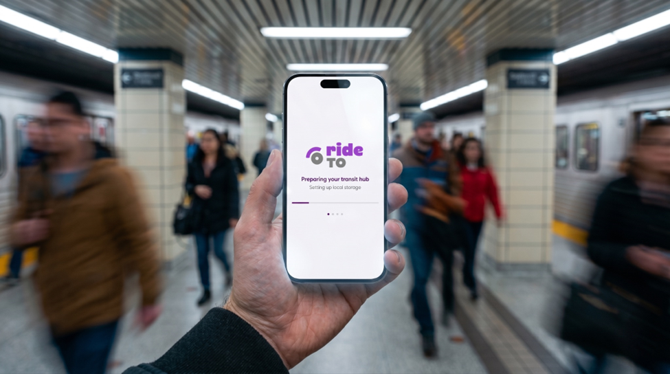
rideTO: An app for daily TTC commuters

rideTO was designed for regular TTC commuters who already know the routes, stops, and stations they use most often.

The core pain point was not discovering how to travel from point A to point B. It was the daily friction of piecing together a reliable picture of their commute from multiple sources: checking one app for next arrivals, X for updated service alerts, and the TTC website for planned closures. That fragmented experience added cognitive load to something commuters needed to do quickly, often while already on the move.

The product strategy focused on one question: how can a commuter absorb the status of their regular TTC trip quickly, accurately, and with less effort, in a single place?

The answer was to unify the experience. Rather than sending riders across different apps and sources, rideTO brings next arrivals, route alerts, subway status, scheduled closures, accessibility outages, and more into one coherent view built around the stops and routes each commuter already knows.

This article covers the product decisions, data sources, and design tradeoffs that shaped rideTO and what it looks like when Toronto Open Data becomes a daily commuter tool.

Product Boundary: Commute Support, Not Route Planning

rideTO is intentionally not a point A-to-B trip planner. It does not generate connecting routes or recommend full itineraries.

Instead, it supports people who already understand their TTC patterns and want a faster way to monitor the services they use regularly.

This boundary keeps the app focused and avoids promising route-planning behaviour it does not provide.

Scannability as the Core UX Principle

Transit information is often consumed under pressure: while walking to a stop, standing on a platform, transferring, checking a phone outdoors, or making a quick decision before leaving home.

For rideTO, scannability is not a visual preference. It is a product requirement.

Each major feature was designed to reduce the amount of cognitive work needed to understand what is happening on screen.

Open Data Strategy

rideTO uses TTC(Toronto Transit Commission) open data as the structural foundation for commute support.

The app draws on TTC route, stop, and schedule data published through the Toronto Open Data TTC routes and schedules dataset. This data helps define the network: route identity, stop identity, stop locations, route-stop relationships, and schedule context.

That foundation is combined with official TTC operational sources: real-time service alerts from the TTC Service Alerts feed, live arrival predictions from the NextBus API, real-time vehicle and trip updates from the TTC GTFS Realtime dataset, and additional data covering scheduled closures, accessibility outages, subway status, slow zones, and service-resumed notices.

The design value comes from turning available data into a coherent screen-level experience that matches commuter habits. Open data impact depends on how well public information is shaped for public use. That shaping is where the product decisions matter.

Accessibility by Design

Accessibility was prioritized across the app, both in content and interface behaviour.

rideTO surfaces elevator and escalator outages because they directly affect whether some riders can complete a regular trip. But accessibility also shaped the broader interface system.

Implemented accessibility-supporting choices include:

  • Lexend typography, a font designed to improve readability and support users with dyslexia
  • French translation, so more Toronto riders can use the app in their preferred official language
  • Motion reduction options, supporting users who prefer reduced animation
  • Theme preference, allowing users to choose a visual mode that is more comfortable for them
  • Progressive web app installation, making the app available from the home screen on iOS and Android

These choices make the product more usable for a broader range of riders, while reinforcing the open-data goal of public access.

Service Blueprint

rideTO can be understood as a commuter information service with frontend and backstage layers.

This blueprint shows how open data becomes practical commuter value through product decisions, not just data availability.

Strategic Tradeoffs

Several tradeoffs shaped the product direction.

These tradeoffs kept rideTO focused on commuter comprehension, accessibility, and practical public value.

Recognition

rideTO won the Canadian Open Data Accessibility Award 2025 from the Canadian Open Data Society, recognizing its use of open data to improve access to transit information for the public.

Closing Thought

The promise of open data is not only that information exists in public. It is that public information can become easier to use in real life.

rideTO was designed for daily TTC riders who already know their commute and need quick, clear answers. Through scannable feature design, accessibility-first choices, and saved commuter context, the app aims to help riders absorb transit information with less effort and greater confidence. Try rideTO at rideto.ca.

About Me

I’m Shaban Mohammed  a UX consultant, civic tech enthusiast based in Toronto.

Powering open data with civic issues

Hey Reham! Let’s start by telling our readers a little bit about you and your role with Toronto Open Data. I’m Reham Youssef. I’m the Marketing and Communications Lead for the open data team, and I’ve been with the City for over fifteen years but in the last ten years, I’ve really been focusing in on open data. Tell us about the project you’re currently working on. Sure. At open data, we always want to know: what do users want? In the past we would accept dataset requests through email and twitter on an ad-hoc basis. We didn’t really have a concise way of gathering data from the public on what they want when it comes to open data and we’ve been trying to establish different criteria that will help us evaluate and prioritize dataset releases. The Mayor recently announced three new city directives. We took that list and identified two more: climate change, which is an important global issue right now, and poverty reduction, which we heard as a consistent theme from the civic tech community. This gave us a list of five total civic issues we wanted to prioritize dataset releases around: affordable housing, poverty reduction, fiscal responsibility, climate change, and mobility. We’re now considering the impact of these civic issues in determining what we release next. Why is it important to know how to prioritize what datasets get released? It’s just a better way to understand data requests, and we wanted to make sure that incoming data requests align as much as possible with these priorities. We can’t release everything at once. Unfortunately we have limited resources and (wo)manpower, and we also have to work with 44 different City divisions. As you can imagine, there are numerous units within the individual divisions that are responsible for data. When we prioritize data, we link it to the city priorities which you can then narrow down to 5 to 10 divisions, which makes it much easier for us to discuss with those divisions instead of all 44. Often times it’s tricky to ask for data when we don’t even know how or where it exists, let alone if it exists in the first place. So we decided to focus in on the most important things for the city. We want to establish a consensus on what users want, and specifically go after that data. Great! So you started by developing a survey that would be filled out by users to inform what civic issues and datasets they wanted. How did that go? Well, when we first went out the door with the initial civic issues survey, we unfortunately didn’t get what we were looking for the first time. Why is that? There were just too many questions, and we were asking for too much detail at the time. People didn’t understand how to respond. We really wanted people to tell us as much as possible, right down to the data attributes, and exactly what they wanted. We started to see that while people know they want to solve problems like affordable housing, they don’t always necessarily know what data they need to address that problem. So what did you do when you found that users weren’t filling out the civic issues survey as expected? After a month, we took the survey down and switched things around. That’s how we got to the second questionnaire, where we simplified it down to 3 simple questions. The wording had to change for people to think differently, and asking people what they wanted and what they wanted to do with the data was the main driver. The reason we asked for what they will do with the data is because of a fun little algorithm we created that I’ll go into detail later. What was the result? Unexpectedly, we were overwhelmed with responses! 875 in total. We received enough information from our users the second time around that we could plug right into the prioritization framework. This gave each dataset request a score as well as informed us as to how many people were asking for the same data in different words. Can you tell our readers a little bit about the prioritization framework? The prioritization framework was developed by the open data team as a way to assess and prioritize upcoming dataset releases. The algorithm was developed by Ryan Garnett, who manages the open data team as well as the geospatial competency center (Editor’s note: Ryan writes frequently for the Open Data Knowledge Center; you can read his articles here) in the form of a dynamic spreadsheet. The framework focuses on five outputs. Each output is given a specific score. The algorithm applies a weighting to all these scores and then outputs an overall ranking. The primary assessment metrics are:

Source

Is the data in a database somewhere or is it in a spreadsheet on someone’s desktop?

Civic Issue

A dataset request that isn’t related to one of the five main civic issues would receive a lower score than one that does.

Requester

Who requested the dataset? Is it requested by council or a member of the public? Different requesters are given different scoring.

Output

What will it be used for? Education? Media? Government city report? Is it for research? Will it be used to create a by-product, like an app?
So the framework lets us figure out where the priority lies for every request. The higher the number, the more we will focus in on getting that data from the appropriate division or unit. Do you think the scores will be made public anytime soon? They’re already public but they aren’t presently linked to the prioritization framework! We’ve got a few more things to do first. We’re reviewing all of our requests, separating one single request perhaps into two or more data requests, manually tagging them with topics or themes and separating them out by civic issue. We’re actively working on releasing that data to the public in a raw format. It’ll contain every single request with the requester listed. What is the benefit of releasing that data to the public? It’ll be our first actual open dataset from open data. Data about the data! Yes, exactly. This will give people the opportunity to take a look and play around with the data. We’re going to analyze the data and figure out how many requests there are based on tags. We’ll plug each one into the framework, then come up with a score that we then report back to the senior management team (SMT) or appropriate division. That we hope to release soon, publically, and ultimately this is how we want to report back. That seems fairly well-aligned with the mandate of open data, which includes transparency as well as data-informed decision making. That’s right. So what are your next steps as this seems like a fairly mammoth undertaking. We’re going to clean the data for the release. My personal next steps are to perform a little bit of an analysis so we can have a cool data story to report back with. I’m not a data scientist, so I’ve never worked with so many sources before, but I’m excited to venture off and try this. I want to have some sort of summary story that tells us the total number of requests, unique tags, and breakdown of civic issues. Ultimately we want users to understand how we took nearly a thousand requests and categorized them with tags and top civic issues. Thank you, Reham, for explaining the open data civic issues campaign and prioritization framework. We welcome reader comments and questions to opendata@toronto.ca.

Strategies for working with new data

Introducing Community Data Stories

We’re excited to present our first community data story by Sharla Gelfand. These data stories feature articles by active members inthe greater open data community who’ve done something interesting with our data. We want to highlight the diversity of meaningful work different users are creating and contributing using Toronto open data. Read “Strategies for working with new data”

About the author

Sharla is an R and Shiny developer and co-organizer of R-Ladies Toronto and the Greater Toronto Area R User Group. Her work focuses on enabling easy access to data and replacing manual, repetitive work with reproducible and future-proof processes in R. Outside of R, Sharla is an eyeshadow aficionado, a shiba inu owner wannabe, a bass player, and a cyclist.

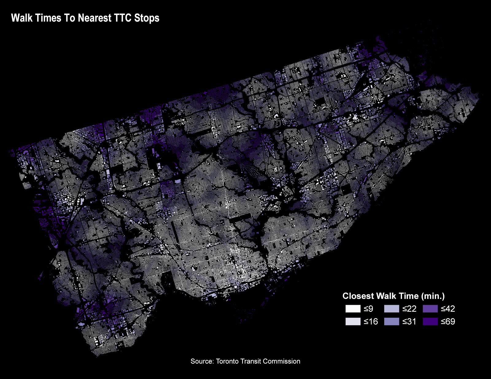
Measuring Walking Times Across Toronto to Nearest TTC Stop

Matthew Tenney (@terra_tenney) is our first guest contributor to Data Stories. In this tutorial, we analyze walk times from every address point within the City of Toronto limits to the closest Toronto Transit Commission (TTC) Stops. TTC stops can include subway, LRT, street car and bus. The analysis uses Pandana to perform the network distance calculations on a new open data set called the “Pedestrian Network” that our team created in conjunction with Transportation Services to better understand walkable access to various amenities across Toronto. Read Measuring Walking Times Across Toronto to Nearest TTC Stop Using the Pedestrian Network and Python on Medium.
Towards Location Intelligence

Do you geo? Interested in location data and location intelligence? The City of Toronto’s Open Data team partnered with BergWerkGIS to update the QGIS CKAN Browser plugin, allowing GIS users to access open data directly within QGIS, the leading open source desktop GIS. No longer do desktop GIS users need to download data from open data portals, with the QGIS CKAN Browser open datasets managed in CKAN are loaded directly into QGIS. Accessing Open Data with QGIS Read the full article on Medium.

Civic Issues Initiative

In this four-part series, we introduce our readers to the Civic Issues campaign. This campaign highlights some of the most important socio-political issues impacting Toronto residents, including hot-button items like housing affordability and poverty reduction. The Civic Issues Initiative survey
What do civic issues have to do with open data? It turns out, quite a bit. It’s important that open data releases reflect the concerns and interests of the city’s residents. Releasing in-demand open data is one way to increase community participation in civic tech, increase data literacy, and activate data-driven decision-making. Solving complex civic problems means ensuring there is a seat at the table for underrepresented voices. Join us as we take you through how we are improving the way open data is created and shared in the city to bring you more of the data you want, when you want it.

How do we currently acquire data requests?

Since the start of Toronto’s Open Data program in 2009, we’ve used many ways to determine what to publish, and when. Some of these ways include keeping tabs on formal and community requests through our e-mail inbox, public consultations, and requests from the media. Once we’re alerted to a dataset request, we connect with the appropriate division to find out if they have the data that’s being asked for, and assess how much effort is involved in acquiring it prior to publishing it. The Open Data team has a highly engaged following on Twitter, which has served as one of the primary ways in which the community can tell us about what they’re interested in. We also track current events and the media to establish the demand for a specific set of related information. We recently launched our monthly newsletter as well, The Open Data Update, which encourages our readers to contact us with requests for data.

Following a request, how is the data acquired?

City divisions like Transportation Services or Parks, Forestry and Recreation can periodically provide us with a ready to go real-time data feed, but not always! A lot of this data is subject to the technical limitations of the time at which it was collected, so much of it is buried. Even when we have access, the formats might be out of date, and there might be issues with consistency. We see these issues in many of the datasets currently hosted on open data. This means that the data would need to be cleaned up, undergo an extensive privacy review, and/or need to be digitized prior to release. It’s a lot of work. There are an estimate 9 petabytes of data in the City, and not all of it can be made open due to privacy, licensing, or technical restrictions either. So it’s essential that we prioritize our releases based on the value their provide to service provisioning.

How does all this relate to civic issues?

As a civic campaign, we’re obligated to demonstrate the socioeconomic value of open data in our reporting. Like other cities, we struggle with demonstrating the true social value of the data that we provide. Many times, we aren’t able to truly demonstrate just how impactful open data can be to a typical resident of the city. It can seem too technical or too bureaucratically inaccessible. How do we change this perspective, and democratize access to open data? Let’s consider some non-technical challenges. Often, the decision-makers in the room don’t usually represent the groups we need to provide services to the most. These are groups with limited data literacy, limited mobility, or economic insecurity. Lived experience is often the best way to understand the unique experience of someone who may be under-housed, or struggle with transit affordability. We need to make sure that we don’t overlook the importance of these communities, and so we want to prioritize the release of data that can positively influence change and provide opportunities for improvement. Evidence shows that decision-making models that involve affected communities and prioritize their needs are typically the most sustainable and scalable.

How do we understand social value?

Let’s pause for a moment and think about a common experience many residents have. Prior to the existence of smartphones, it was difficult to predict transit delays, and commuters had few options outside of waiting. Through access to historical transit data, a frustrated commuter was able to develop an app-based solution that can predict the arrival time of your bus with a high level of accuracy. This example, and countless others from our community, demonstrate the value of open data in case studies that are identifiable to a diverse range of city residents. As such, we have a responsibility to dismantle the barriers that contribute to the under-representation of marginalized communities in civic technology. So how do we truly engage a diverse audience? How do we ensure everyone gets a seat at the table? How do we ensure that we balance feelings with facts to create policies that benefit the residents of Toronto? Simple. We listen. In the interest of working within a data-driven government model, sometimes this will mean delving into the uncomfortable, and being honest and transparent with data that shows us where there’s room for improvement. Open data is also about self-sufficiency. We want to reduce barriers to access. We want anyone who wants our data to be able to use it openly and transparently, whether they’re going to start a business or create a community campaign in support of a social issue they care about. The Civic Issues Initiative survey

Exploring Bike Share Ridership

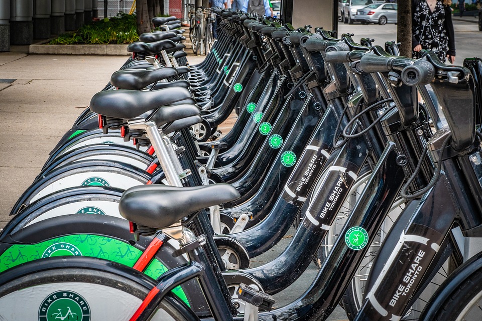
bikeshare logoOver the past few years, Bike Share has become an increasingly attractive way to get around the city. Considering the amount of bike theft in my neighbourhood, Bike Share’s speedy expansion of station coverage, and rising TTC fares, it was an easy decision for me to renew my membership for the third year this March. People were making similar decisions in the US as well: in 2017, cyclists in the US took 35 million trips through a bike-sharing program, a 25% increase from 2016. Meanwhile, Bike Share Toronto saw an 81% ridership increase during the same time period. I wanted to explore the Bike Share Ridership dataset to better understand how Torontonians are using Bike Share and to demonstrate some techniques that can be used to explore the other 294 (and counting) datasets released by the Open Data Program. Read it on Medium: Exploring Bike Share Ridership