Hey Reham! Let’s start by telling our readers a little bit about you and your role with Toronto Open Data.
I’m Reham Youssef. I’m the Marketing and Communications Lead for the open data team, and I’ve been with the City for over fifteen years but in the last ten years, I’ve really been focusing in on open data.
Tell us about the project you’re currently working on.
Sure. At open data, we always want to know: what do users want? In the past we would accept dataset requests through email and twitter on an ad-hoc basis. We didn’t really have a concise way of gathering data from the public on what they want when it comes to open data and we’ve been trying to establish different criteria that will help us evaluate and prioritize dataset releases.
The Mayor recently announced three new city directives. We took that list and identified two more: climate change, which is an important global issue right now, and poverty reduction, which we heard as a consistent theme from the civic tech community. This gave us a list of five total civic issues we wanted to prioritize dataset releases around: affordable housing, poverty reduction, fiscal responsibility, climate change, and mobility. We’re now considering the impact of these civic issues in determining what we release next.
Why is it important to know how to prioritize what datasets get released?
It’s just a better way to understand data requests, and we wanted to make sure that incoming data requests align as much as possible with these priorities.
We can’t release everything at once. Unfortunately we have limited resources and (wo)manpower, and we also have to work with 44 different City divisions. As you can imagine, there are numerous units within the individual divisions that are responsible for data.
When we prioritize data, we link it to the city priorities which you can then narrow down to 5 to 10 divisions, which makes it much easier for us to discuss with those divisions instead of all 44. Often times it’s tricky to ask for data when we don’t even know how or where it exists, let alone if it exists in the first place. So we decided to focus in on the most important things for the city. We want to establish a consensus on what users want, and specifically go after that data.
Great! So you started by developing a survey that would be filled out by users to inform what civic issues and datasets they wanted. How did that go?
Well, when we first went out the door with the initial civic issues survey, we unfortunately didn’t get what we were looking for the first time.
Why is that?
There were just too many questions, and we were asking for too much detail at the time. People didn’t understand how to respond. We really wanted people to tell us as much as possible, right down to the data attributes, and exactly what they wanted. We started to see that while people know they want to solve problems like affordable housing, they don’t always necessarily know what data they need to address that problem.
So what did you do when you found that users weren’t filling out the civic issues survey as expected?
After a month, we took the survey down and switched things around. That’s how we got to the second questionnaire, where we simplified it down to 3 simple questions. The wording had to change for people to think differently, and asking people what they wanted and what they wanted to do with the data was the main driver. The reason we asked for what they will do with the data is because of a fun little algorithm we created that I’ll go into detail later.
What was the result?
Unexpectedly, we were overwhelmed with responses! 875 in total. We received enough information from our users the second time around that we could plug right into the prioritization framework. This gave each dataset request a score as well as informed us as to how many people were asking for the same data in different words.
Can you tell our readers a little bit about the prioritization framework?
The prioritization framework was developed by the open data team as a way to assess and prioritize upcoming dataset releases. The algorithm was developed by Ryan Garnett, who manages the open data team as well as the geospatial competency center (Editor’s note: Ryan writes frequently for the Open Data Knowledge Center; you can read his articles here) in the form of a dynamic spreadsheet.
The framework focuses on five outputs. Each output is given a specific score. The algorithm applies a weighting to all these scores and then outputs an overall ranking.
The primary assessment metrics are:
Source
Is the data in a database somewhere or is it in a spreadsheet on someone’s desktop?
Civic Issue
A dataset request that isn’t related to one of the five main civic issues would receive a lower score than one that does.
Requester
Who requested the dataset? Is it requested by council or a member of the public? Different requesters are given different scoring.
Output
What will it be used for? Education? Media? Government city report? Is it for research? Will it be used to create a by-product, like an app?
So the framework lets us figure out where the priority lies for every request. The higher the number, the more we will focus in on getting that data from the appropriate division or unit.
Do you think the scores will be made public anytime soon?
They’re already public but they aren’t presently linked to the prioritization framework! We’ve got a few more things to do first. We’re reviewing all of our requests, separating one single request perhaps into two or more data requests, manually tagging them with topics or themes and separating them out by civic issue. We’re actively working on releasing that data to the public in a raw format. It’ll contain every single request with the requester listed.
What is the benefit of releasing that data to the public?
It’ll be our first actual open dataset from open data.
Data about the data!
Yes, exactly. This will give people the opportunity to take a look and play around with the data. We’re going to analyze the data and figure out how many requests there are based on tags. We’ll plug each one into the framework, then come up with a score that we then report back to the senior management team (SMT) or appropriate division. That we hope to release soon, publically, and ultimately this is how we want to report back.
That seems fairly well-aligned with the mandate of open data, which includes transparency as well as data-informed decision making.
That’s right.
So what are your next steps as this seems like a fairly mammoth undertaking.
We’re going to clean the data for the release. My personal next steps are to perform a little bit of an analysis so we can have a cool data story to report back with. I’m not a data scientist, so I’ve never worked with so many sources before, but I’m excited to venture off and try this. I want to have some sort of summary story that tells us the total number of requests, unique tags, and breakdown of civic issues.
Ultimately we want users to understand how we took nearly a thousand requests and categorized them with tags and top civic issues.
Thank you, Reham, for explaining the open data civic issues campaign and prioritization framework. We welcome reader comments and questions to opendata@toronto.ca.
By Connie Volpe
This month, we’re featuring a project that we’ve been working on in partnership with the Lobbyist Registrar for the City of Toronto. The Office of the Lobbyist Registrar ensures the public disclosure of lobbying activities and oversees the regulation of lobbyists’ conduct. The City of Toronto publishes this data through the Lobbyist Registry Disclosure Site and through the Open Data Portal.
What is the Lobbyist Registrar?
The Lobbying By-law describes lobbying as communicating with a City of Toronto public office holders (POHs) about concerns that are the subject of City government decisions. The initial communication is reported by the Lobbyist through the Lobbyist Registry System within 3 business days of the communication occurring. The information is refreshed on the Lobbyist Disclosure Site every half hour; the Open Data Portal pulls the data daily
The dataset contains multiple years worth of data. After June 2010, lobbyists began reporting communication on a Registry System. After December 2018, the datasets reflects 25 wards, so Members of Council and their staff may reflect multiple wards as a result. Further after January 2019, the datasets have been ‘cleansed’ to ensure “correct spelling, divisions/offices being recorded correctly, etc.
What did we want to learn?
What can we learn from the data?
Who are the most lobbied City of Toronto POHs by type and division?
What are the most lobbied divisions and offices?
What types of lobbyists are communicating with City of Toronto POHs?
Where are the lobbyists located?
How is the data being used?
How we did it
Step 1. Prepare data for analysis
Prior to working with the data, it’s important that we prepare it first. This step includes data cleaning and transformation because almost 80% of data work can mean simply getting it ready for analysis. Preparation varies per dataset, but common tasks performed at this step include:
Fix mistakes (i.e. spelling of division/office titles, Countries, Provinces/States and Cities)
Ensure wards and divisions are reported correctly and are associated with the appropriate Councilor and their staff
Target Time Frame e.g. consolidating data based on the time frame we’re interested in examining
Performing data quality is a large and sometimes complex process, but it’s an essential part of getting started with data analysis. Cleaning the data can be tasking if individuals report communication without the correct the Ward, division or office title. If an individual reports the incorrect information, we have to search the directory to see where that title is located and have the lobbyist correct the report of communication.
One example of this error, with the changeover to the new term, was the reporting of communications with Councillors using their new ward numbers. When reporting communication on the lobbyist registry system, an individual reports the communication method and date with the public office holders they have communicated with before. With many of the previous term councillors returning however, lobbyists needed to add the returning councillors as New Public Office Holders.
We audit the data to ensure we find these inconsistencies in a timely manner. When found, a Lobbyist Registry Advisor goes back to the lobbyist(s) and provides the steps and information to correct their report of communication. Extensive follow ups are sometimes required.
Furthermore, the previous Registry System was only compatible with legacy browsers. Understandably, this contributed greatly to the difficulties of correcting the reports of communication. When tasked with updating the reports of communication, especially those prior to 2017, many lobbyists had difficulties as the use of modern browsers would not allow them to update the subject matter. We have since addressed the issue with the introduction of our new lobbyist registry system. This system now allows lobbyists to report their communication immediately regardless of the browser or device they are using.
Step 2. Cleaning the data
The first step in determining the most lobbied City of Toronto groups is to clean the data. This is done to ensure that the information is accurate and consistent. Wards and Divisions must have the correct titles and the number of wards may not exceed 25.
To do this we pull the data and import it into a spreadsheet program, like Google Sheets or Excel, where we organize it by Public Office Holder (POH) Type. We check for inconsistencies and ensure the titles of the wards and divisions are in accordance to the Staff Directory on the City of Toronto Website. Any discrepancies or unclear information is sent back to a Lobbyist Registry Advisor to get the information corrected to ensure the data is clean and accurate for anyone viewing the disclosure site.
Once we have the accurate information we upload the spreadsheet into PowerBI. We then select our visualization tool and select POH_Type for Axis under Value Count of Communication. To break the data down further, we go to Report Level Filters and insert the Communication Date Field and select advanced filtering. Under the Report Level Filters is where we would select PowerBI to show items from January 1, 2019 12 a.m. to June 30, 2019 11:59 p.m. This will bring up all communication reported between the filtered dates.
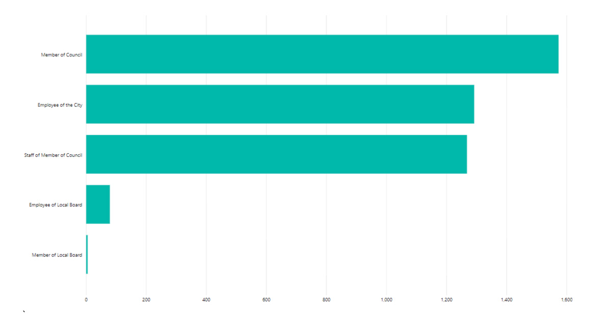
Communication by POH Type for the period of Jan to June 2019
Step 3. Measuring frequency
To see frequency of lobbying activities by division, we select a new visualization tool. In the filters, we select POH_Office in the Axis, and under Value we enter Count of Communication. Under the Filter area and under visual Level Filters we bring the Count of Communication field, POH_Office (ALL) and POH_Type (Select Employees of the City). Under the Report Level Filters is where we filter the period to only show from January 1, 2019 12 a.m. to June 30, 2019 11:59 p.m. This will bring up all communication reported between the filtered dates and time.
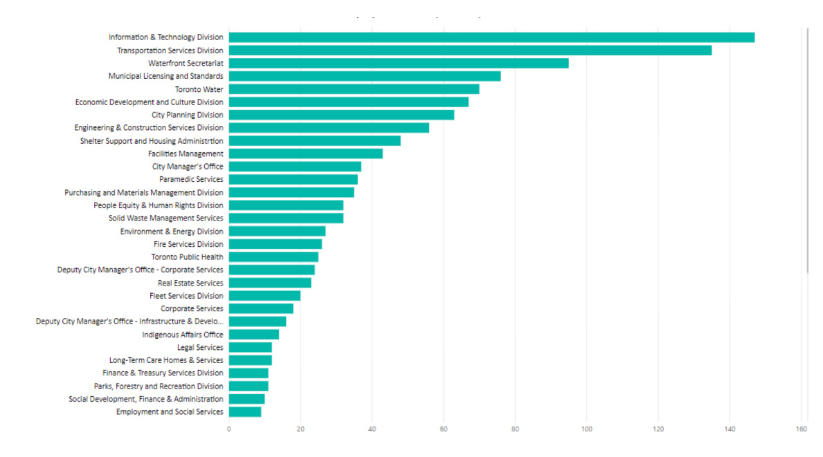
Communications with Employee of the City for the period of Jan to June 2019
In the above sample, we note that as of June 2019 the Information and Technology division was the most lobbied division in the City of Toronto. This information is not surprising as the City of Toronto has recently taken on many new technology initiatives.
Step 4. Identify types
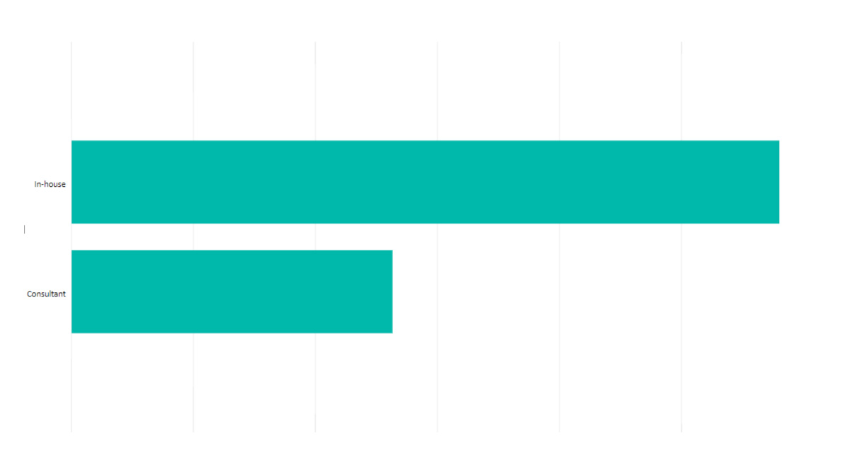
To see which lobbyist types are lobbying City of Toronto POHs the most, we start by selecting a new visualization tool. In the filters, we select Type in the Axis, and under Value we would enter Count of Communication. To filter, we go under Visual Level Filters to bring up the Count of Communication field. We Type (ALL). Under the Report Level Filters, we can filter the period to only show items from January 1, 2019 12 a.m. to June 30, 2019 11:59 p.m.
Communication by Type of Lobbyist for the period of Jan to June 2019
Step 5. Location, Location, Location!
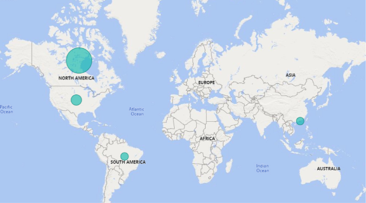
To see where the individuals or organizations that are lobbying City of Toronto POHs are located select a new visualization tool, (specifically a map) and, in the filters, Country under location. Under size we select the Count of Communication field. Under the Report Level Filters, we can filter the period to only show items from January 1, 2019 12 a.m. to June 30, 2019 11:59 p.m.
Location of Lobbyists for the period of Jan to June 2019
When we pulled the information to determine the location of individuals and organizations that lobby the City of Toronto, it was very interesting to see individuals and organizations as far as Brazil and China were lobbying City of Toronto Public Office Holders and not just North America.
Step 6. Identify use
This information is used by members of the Media, Public and the Office of the Lobbyist Registrar. Individuals in the media use the data to report on what topics are being discussed at the City of Toronto. This information has been published in a variety of newspaper publications as well as weekly newsletters where the individual/organization takes the information from Open data and explains in further detail the topics that being discussed at Council or Committee level.
The Office of the Lobbyist Registrar uses open data for outreach and education. We use the tool to provide the public with a breakdown of how many communications are reported, the type of lobbyists and which offices/divisions are lobbied the most and what topics these communications concern.
Our office uses open data to educate the City of Toronto POHs about lobbying and related activities that involve their offices and/or divisions. This allows the POH to understand how lobbying communications directly impact their office/division. It emphasizes the importance the POH should take to ensure the individual or organization is registered with our office.
Next Steps
The Office of the Lobbyist Registrar intends to continue using our Open data set to further tell the story of the lobbying communication that is taking place at City of Toronto. Further we are going to continue to explore different ways to use the data to make it more meaningful for City of Toronto Public Office Holders and for members of the Public. This will give them a better understanding of how lobbying activities can affect them directly.
In this four-part series, we introduce our readers to the Civic Issues campaign. This campaign highlights some of the most important socio-political issues impacting Toronto residents, including hot-button items like housing affordability and poverty reduction.The Civic Issues Initiative survey
What do civic issues have to do with open data? It turns out, quite a bit. It’s important that open data releases reflect the concerns and interests of the city’s residents. Releasing in-demand open data is one way to increase community participation in civic tech, increase data literacy, and activate data-driven decision-making. Solving complex civic problems means ensuring there is a seat at the table for underrepresented voices. Join us as we take you through how we are improving the way open data is created and shared in the city to bring you more of the data you want, when you want it.
How do we currently acquire data requests?
Since the start of Toronto’s Open Data program in 2009, we’ve used many ways to determine what to publish, and when. Some of these ways include keeping tabs on formal and community requests through our e-mail inbox, public consultations, and requests from the media. Once we’re alerted to a dataset request, we connect with the appropriate division to find out if they have the data that’s being asked for, and assess how much effort is involved in acquiring it prior to publishing it.
The Open Data team has a highly engaged following on Twitter, which has served as one of the primary ways in which the community can tell us about what they’re interested in. We also track current events and the media to establish the demand for a specific set of related information. We recently launched our monthly newsletter as well, The Open Data Update, which encourages our readers to contact us with requests for data.
Following a request, how is the data acquired?
City divisions like Transportation Services or Parks, Forestry and Recreation can periodically provide us with a ready to go real-time data feed, but not always! A lot of this data is subject to the technical limitations of the time at which it was collected, so much of it is buried. Even when we have access, the formats might be out of date, and there might be issues with consistency. We see these issues in many of the datasets currently hosted on open data. This means that the data would need to be cleaned up, undergo an extensive privacy review, and/or need to be digitized prior to release.
It’s a lot of work. There are an estimate 9 petabytes of data in the City, and not all of it can be made open due to privacy, licensing, or technical restrictions either. So it’s essential that we prioritize our releases based on the value their provide to service provisioning.
How does all this relate to civic issues?
As a civic campaign, we’re obligated to demonstrate the socioeconomic value of open data in our reporting. Like other cities, we struggle with demonstrating the true social value of the data that we provide.
Many times, we aren’t able to truly demonstrate just how impactful open data can be to a typical resident of the city. It can seem too technical or too bureaucratically inaccessible. How do we change this perspective, and democratize access to open data?
Let’s consider some non-technical challenges. Often, the decision-makers in the room don’t usually represent the groups we need to provide services to the most. These are groups with limited data literacy, limited mobility, or economic insecurity. Lived experience is often the best way to understand the unique experience of someone who may be under-housed, or struggle with transit affordability. We need to make sure that we don’t overlook the importance of these communities, and so we want to prioritize the release of data that can positively influence change and provide opportunities for improvement. Evidence shows that decision-making models that involve affected communities and prioritize their needs are typically the most sustainable and scalable.
How do we understand social value?
Let’s pause for a moment and think about a common experience many residents have. Prior to the existence of smartphones, it was difficult to predict transit delays, and commuters had few options outside of waiting. Through access to historical transit data, a frustrated commuter was able to develop an app-based solution that can predict the arrival time of your bus with a high level of accuracy. This example, and countless others from our community, demonstrate the value of open data in case studies that are identifiable to a diverse range of city residents. As such, we have a responsibility to dismantle the barriers that contribute to the under-representation of marginalized communities in civic technology.
So how do we truly engage a diverse audience? How do we ensure everyone gets a seat at the table? How do we ensure that we balance feelings with facts to create policies that benefit the residents of Toronto?
Simple. We listen.
In the interest of working within a data-driven government model, sometimes this will mean delving into the uncomfortable, and being honest and transparent with data that shows us where there’s room for improvement. Open data is also about self-sufficiency. We want to reduce barriers to access. We want anyone who wants our data to be able to use it openly and transparently, whether they’re going to start a business or create a community campaign in support of a social issue they care about.
The Civic Issues Initiative survey
Our debut community showcase tells the story of a project that is regarded as a pioneer in Toronto’s Civic Tech space, and a powerful example of how Open Data empowers citizens to participate in government decision-making; Budgetpedia.
For those of you who are wondering, what in the world is civic tech? Here’s my take on what it means:
Civic tech is an emerging group of both citizens (technologists, designers, educators, students, researchers, entrepreneurs) and government workers who together explore ways that technology can help enhance and improve how we understand and interact with one another. The interactions which form the basis of a relationship between government and citizens; access to public services, public participation in government decision-making, and public perception on government transparency, are all beneficiaries of this collaborative effort.
Pretty inspiring, right?
What’s even more incredible is that this isn’t a uniquely Toronto movement, as there are more and more groups that share the same purpose and are self-convening across the globe; Ottawa, Edmonton, London, Kitchener-Waterloo, Chicago, New York City, Taiwan, Italy, France, Belgium, Africa…and it goes on. The Toronto chapter—CivicTech TO—which holds weekly Tuesday evening ‘hacknights’ at rotating venues across the City—held their very first meeting in 2015, Budgetpedia being one of the first projects pitched to the group.Henrik Benchmann attended the first CivicTech TO hacknight with an idea: to help better explain Toronto’s budget. As a former software developer who has worked for various multi-national companies, much of his work involved operations, marketing, and database driven applications that sat beside their accounting systems. Henrik would often take complex datasets and present them in ways that made sense to management, something he says he rather enjoys doing.
I’d say he’s rather exceptional at it too.
In the beginning, Henrik focused his efforts on helping simplify the presentation of the City’s budget. He did this focusing on the language used to classify budget allocations. “City Centered Services A and B doesn’t explain anything, it’s very inward looking, arbitrary, and it bugged me. So I recombined them in ways that made sense,” Henrik explains. Through several iterations, Henrik regrouped the City’s Divisions and Agencies into categories he feels the general public can better interpret and recognize with ease.
Here’s an example of the City’s taxonomy used to group Divisions and Agencies when presenting both Operating and Capital budgets, taken directly from the City’s website:
Citizen Centred Services “A”
Affordable Housing Office
311 Toronto
Children’s Services
Court Services
Economic Development and Culture
Long-Term Care Homes & Services
Parks, Forestry & Recreation
Social Development, Finance and Administraiton
Shelter, Support & Housing Administration
Toronto Employment & Social Services
Toronto Paramedic Services
Citizen Centred Services “B”
City Planning
Engineering and Construction Services
Fire Services
Municipal Licensing & Standards
Policy, Planning, Finance and Administration
Solid Waste Management Services
Toronto Building
Transportation Services
Toronto Water
Waterfront Revitalization Initiative
Here’s how these same groupings are presented through Budgetpedia:
General Services (Getting through the day), about $4.9B
Utilities (2,886 staff for waste/water)
Waste
Water
Electricity (owned)
Moving around (13,686 staff)
Roads
Parking
Transit/Wheeltrans
Public Commons (7,520 staff)
Parks
Libraries
Attractions
Conservation
Citizen support services (getting help), about $4.6B
Emergency Services (12,761 staff)
Police
Fire
Paramedics
Wellbeing – Health & Education (5,160 staff)
Public Health
Long Term Care
Children’s Services
Income & Housing (2,770 staff)
Housing Support
Income Support
Using these groupings as a framework, Henrik has spent the past two and a half years working with approximately 100 volunteers to create interactive, user-friendly visualizations of the City’s annual budget; a feature on Budgetpedia.ca called the Budget Explorer. They did this by analyzing and synthesizing the City’s open datasets (operating & capital), budget analyst notes, and contextual process-related information gathered through FOIs.
Behind the clean and functional design of the graphs and drill-down charts, Henrik shares that there are ways that we can improve the overall quality of the City’s budget data. After having spent two and a half years working closely with the data available, Henrik feels that processes used to assemble, collect and transfer budget data could benefit from greater automation. Through the use of automation, he explains, this can help shorten time to release data, minimize the margin for potential errors and produce more granular, localized data.
The good news is, we’re heading in the right direction. With support from 42 public advisory group members–including Henrik– who share the same desire to help mature the City’s Open Data program, we’ve co-developed an Open Data Master Plan and Roadmap with the community. The plan is designed to address these kinds of opportunities over the next four years; identifying ways to help increase the quantity and quality of datasets through solutions like automation. More details on the topic of modernization can be found in the Foundations section of the Plan.
Today, Budgetpedia’s mandate has evolved, shifting from simplifying the City’s budget to inspiring informed action on budget decision-making. Over the past year, the number of unique visitors accessing Budgetpedia has increased by 35%, attracting approximately 120 users monthly. What’s even more impressive is that the total number of visits received has increased by 92%, while its bounce rate has decreased by 33%. This tells us that not only is the appetite for budget information growing, but more users are engaging with the data presented through Budgetpedia.
Henrik, along with 8 core members who are actively contributing to Budgetpedia, have undertaken a comprehensive review of the site’s current user experience architecture. Through their research, the team is identifying ways the site can be enhanced to help users understandhowtheCitybudgetrelatestotheissuestheycareabout,andfeelempoweredtogetinvolvedorsharetheiropinions. To achieve this, Henrik explains, “We’ve gone from just data to data stories.”
According to Henrik, Budgetpedia’s primary audience are ideally journalists, bloggers, City Councillors and staff. The general public is another important audience. These are people who have some interest to learn about the City they live in, and happen to discover Budgetpedia through a google search. Through a series of interviews held at CivicTechTO, participants were asked to complete a series wayfinding exercises to help the team understand how members of these two audiences differ in behaviours and needs. The findings of this exercise were used to inform the development of a prototype for the next version of Budgetpedia.
Rafi Chaudhury–the web designer behind the new prototype–designed a visually engaging site that includes context-rich interactive data stories on City finances, catering to all levels of knowledge. Stories range from introductory backgrounders that show and tell how concepts like deficits and surpluses are calculated and their implications, to more in depth analyses of program-specific budget data. At the heart of each narrative is this humanizing component that allows users to quickly develop a connection with the numbers presented. “We find that motivates people and gets them to participate more,” Rafi explains.
In the future, Budgetpedia plans to become incorporated as a non-profit under “Open Budgets Canada,” with an established board of members who will help mobilize the project’s priorities with greater reach. Discussions are currently underway to create an API (Application Programming Interface) that will allow 3rd parties to tap into all the data presented through the site, so they can be reused to create applications and visualisations of their own. The project team also plans to take an environmental scan of budgets in the GTA, allow for further analysis of Toronto in comparison to neighbouring jurisdictions.
The new site is slated for release in the upcoming spring. To get involved with Budgetpedia, you can expect to find the project team at Civictech TO’s weekly hacknights; two and a half years later and going strong.